The Basic Properties of Color

Color is one of the most important tools you have in your kit. Do you understand the best ways to use it? Here are the basics.
Top image via Shutterstock
Color. It has been with you since the day you were born, and it will be with you until the day you die. A particular color can make you recall a fond childhood memory, another color can warn you of danger, and another may tell you how hot or cold something is.
Moreover, as a storyteller, either through motion or still pictures, color is one of the most important tools you have in your kit. A simple tweak of the color could give your image an entire new symbolic or literal meaning to your image. For example, see the picture below.

Image: Psycho III via Universal Pictures
With a simple color tweak, the house from Psycho becomes less haunting and more welcoming. (This color change revolves around a change in color temperature. You can read more about that here.)
Knowledge of color is not just a factor needed to color grade sufficiently. I am confident you’ve probably used the tools (or something similar) in the picture below.

Many are adequate with color grading and color correcting and will likely know their way around basic correction software. However, do you know exactly what is happening when you desaturate an image? Of course, the image is losing its ‘color,’ but how does it lose it? Knowing that information will help you make better decisions and ultimately better your work. Understanding basic color theory will not only assist you in post, but it will help with set design, costume, lighting and so much more.
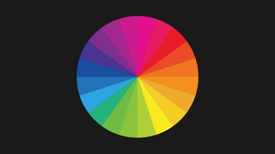
 Image: A hue color wheel
Color itself has three primary qualities: Hue, Chroma, and Value, also known as Hue, Saturation and Lightness.
Hue
We identify hue as a familiar color’s name, such as blue, which represents a particular wavelength of visible light. It is of the wavelength’s dominance that produces a particular hue.
Simply put, hue describes the wavelength of the color. If science class is nothing but a distant memory and this talk of wavelengths has you tangled in a nostalgic web, here’s a quick recap on the science of color wavelengths.
Human eyes can only process a tiny region of the electromagnetic spectrum; we call this visible light. Part of the electromagnetic spectrum is measured in nanometers (nm), and the colors we can see fall between 400-700nm. Violet light and blue light have the shortest wavelengths and become scattered a lot easier in comparison with red, which has the longest [visible] wavelength of 635-700nm.

What does this have to do with color theory? The answer is everything. The length of wavelengths will change what color is seen. The reason why the sky is blue is that blue wavelengths of light become scattered through our atmosphere. If green had the shortest wavelength, we would have a green sky.
On a daily basis, you can see the process of dominant wavelengths changing the color of our environment. It is visually demonstrated at sunrise and sunset, also known as golden hour. As the sun is just about level with the horizon, the light has many miles of dense atmosphere to travel through and the blue light [wavelengths] becomes even more scattered in the atmosphere, leaving the longer wavelengths of yellow, orange & red to illuminate what we see.
It is important to note that hues are not just light at one wavelength. Blue does not exist because the other wavelengths have ceased from the light spectrum. Each hue contains the entire array of wavelengths found in visible light, but one will be more dominant than the others which creates a distinct hue.
Therefore, a hue is the founding dimension of a color determined by wavelength; in short, hue is just the base color. Below are the colors azure, cerulean, sapphire and aquamarine. While they each have their distinct properties, they are of a blue hue.

When you start to add chroma and value to a hue, you start to create new tints, tones, and shades of a color.
There is often discussion and arguments over what colors correctly are classed as ‘pure hues.’ Is it violet or magenta? Different color systems will vary slightly. For this article, we will use the most popular opinion of what classifies as pure hues: Red, Violet, Blue, Green, Yellow, and Orange. These six colors can be broken down into the following groups.
Primary Hues
Theoretically, these hues are known to be classed as primary, as they cannot be created by mixing other hues together. These are red, blue and yellow. This is not to be confused with primary colors of video, as video uses an additive color system of RGB.

Secondary Hues
Secondary hues can each be produced by mixing two primary hues. These are orange, violet and green.

Tertiary Hues
Tertiary hues are usually named and created by mixing adjacent primary and secondary hues. For example, red-orange is the tertiary hue between red and orange. Blue-green (cyan) is the tertiary hue between blue and green.

Chroma/Saturation
Chroma, more often called saturation, refers to the intensity and purity of a hue. A hue will be most vivid in its natural state at 100% saturation. At 0% you will have the monochrome luna component.

You can decrease the intensity of a hue by adding gray. Every increment of gray adjusts the tone of the pure hue. You can also desaturate a hue by adding its complementary color. For example, if we take a swatch of red and add a small amount of cyan (red’s complementary color), the grayer the red will become.
When equal amounts of cyan and red are mixed, there will be no trace of either hue — only the gray will remain.
Value/Lightness
The third property of color is value (lightness). Value measures the degree of light reflected — how light or dark a color is. Adding white makes the color lighter, which in turn creates tints, and adding black makes it darker and creates shades.

The effect of value is relative to other components in the composition. For example, the image below shows three distinct differences in value because of the backgrounds.

For one color of a particular hue, the perception of lightness is also more intense if we increase saturation. For example, a saturated yellow will always look brighter than a saturated blue. The practicality of this application is incredibly useful for directing the audience’s attention to specific areas within your frame.
Much like the English language, there are plenty of color terms that have multiple meanings. For example, chroma is one of the two components of a video signal that carries color information. Likewise, sometimes brightness and lightness can be interchanged. However, brightness is a human visual perception.
As previously stated, understanding the basic properties of color is not a skill that only editors and colorists should learn. Filmmakers of all positions will better themselves knowing how colors work.
How has understanding color theory changed your approach to filmmaking, videography, and photography? Share your story in the comments below.