DaVinci Resolve: Working with Memory Colors

Rendering “memory colors” accurately can bring your project to life.
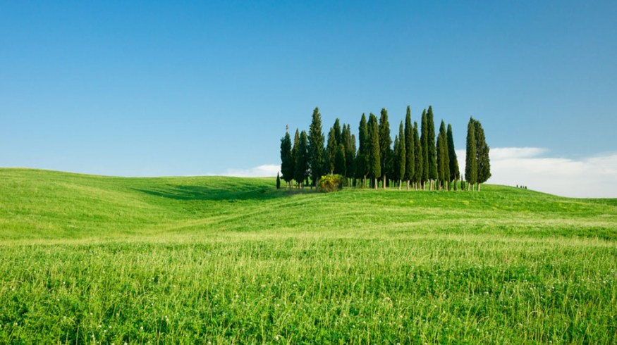
Humans store memories of specific colors like we remember life events. The most common of these memory colors include grass, sky, and human skin tones. It’s curious that all of us recall nearly the same colors for these specific things, perhaps the result of millennia of evolution.
It’s poetic that the strongest memory colors are tied to the red, green, and blue primaries on which fundamental color theory is based. Skin is a shade of red, grass is green, and the sky is blue. As we grow, we form specific color memories for textures like wood and steel. Humans also tend to remember the color of distinct animals like giraffes and peacocks.
Rendering memory colors accurately makes your projects more lifelike. Whether you’re in session as colorist or creative, pay attention to several objects in the scene, notably sky, grass, and skin tones and depict them as authentically as possible. If there are multiple people present, there may be a range of what is acceptable. One person may want grass very saturated, while another might prefer less saturation with an emerald-green hue, not a yellow-green one. This scope of reasonable values could be based on each person’s different cultural experiences and varietal intake of media. Over time, these experiences alter our perceptions of how things look.
The majority of us that aren’t professional colorists may not always be aware of media’s influence on our color memories. I believe one of the biggest influencers is our perception of black and white, our most fundamental colors.
Changing Black and White Points
A current trend, especially in fashion work, involves tinting the blacks a shade of blue. Many creatives think this effect rarely worsens the image, and I personally agree. Pleasing color contrast occurs when bluish whites or shadows play against reddish skin tones.
I remember coloring for a fashion brand several years ago. One setup featured a model against a white background. I balanced for white using my scopes to make sure the red, green and blue combined to make perfect white.
When the client arrived, they had me skew the whites dramatically toward blue. To them, and maybe to you, this read as a cleaner white. What’s going on here?
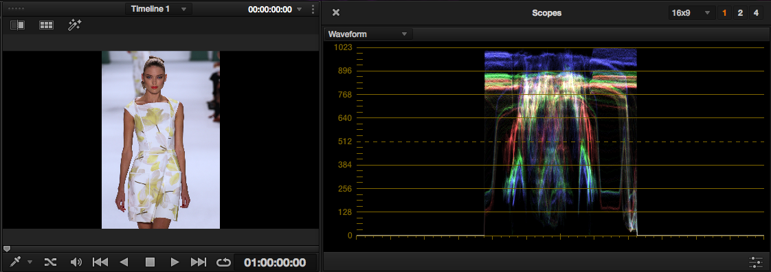
I’ve recreated the client scenario above with an image courtesy of Shutterstock. The scopes on the original image show a slight bias toward red, evidenced by the slightly higher red in the upper part of the waveform.
I’ve white balanced the image as best I can.

This approximates the look the client actually went with. The whites have been skewed toward blue, a look which may look cleaner and brighter to you.
One of the factors at play is the shift away from incandescent bulbs, which are rated in the warm range of 2,700 to 3,300 Kelvin. The shift towards energy-efficient lighting isn’t just good for the environment. It also means there are more available color temperatures from which to choose. For example, LCD and CRT screens are more blue and can rate up to 10,500 Kelvin.
Bluer lights at higher color temperatures can be perceived as brighter and cleaner, whereas by comparison, traditional orange light might look dim and dirty. As this perception becomes more accepted, creatives at ad agencies, photographers, colorists and others working in visual fields may shift their whites toward blue. Their output will enter the media where it affects others. The color shift can become reinforced over time.
Your Industry’s Perception: Natural Versus Commercial
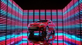
Consider that your preferences may be affected by your industry. For high-end commercial brands, there may already be established color palettes that work for certain products. Steel-blue watches, golden necklaces, brilliantly saturated automobile chrome, perfect black screens of consumer electronics, and candy-colored kid’s cereals are some common examples. Knowing where the boundaries of convention lie can help determine if color will distinguish your brand or if you’re going too far just for a cool look.
For example, skin tones are fairly desaturated, but it’s common practice on commercial jobs to push the saturation on skin past the realm of normalcy. Fashion clients often want skin veering towards magenta. It’s amazing how many people perceive natural skin as green.
I’ve been asked to introduce artificial blue into white skies more times than I can count. Humans just don’t accept a white sky, even if the image is overexposed. Our eyes always seem to want that blue tinge. It’s de rigueur for me to qualify the sky and swing the highlights into slight blue as per client direction. Maybe I’ll edge the saturation up a little, but it can quickly look fake if it’s pushed too far.
Where Does That Leave Us?
A growing consciousness of color grading is seeping into public awareness. While it’s still far from comprehension for many, its popularity is evident, seen in the growing number of images uploaded with a considered, deliberate color palette to social media.
An image’s color can work with memory colors or oppose them. While it’s not a bad idea to preserve memory colors, if you choose a more extreme palette, you may want to abandon natural tones in favor of making the shot sing in its own way. When in session, consider how extreme you want your colors. It may be that you’re grading natural objects and it doesn’t make sense to impose a radical look on something. Or, that may be precisely what makes sense. It’s most important for a mood or viewpoint to work in service of the project as a whole.
Want to read more about memory colors? Check out this article by filmmaker Stu Maschwitz. For more about working with colors in DaVinci Resolve, take a look at these posts:
- Color Grading: Bleach Bypass Looks in DaVinci Resolve
- The Isolated Color Look in DaVinci Resolve
- Color Grading: Using DaVinci Resolve’s Multiple Split Screens
Ever noticed the influence of memory colors on your work? Let’s talk about it in the comments below.