7 Must-Know Guidelines for Motion & Title Design

These 7 design guidelines will help your title and motion graphic designs look polished and professional.

Video editors are often called to do titles and graphics, but often haven’t really had any training in the basics of graphic design. Motion graphics artists probably have a higher rate of graphic design education, but it’s not guaranteed.
For those of you that fall into the category of wanting to make better graphics for your videos, but not really knowing what goes into making a good design, here are a few general design guidelines and rules that should help you out. This isn’t an exhaustive list, but it covers the things I’ve seen most often and implemented in my own design work.
1. Contrast Is Key
Contrast is everything. Yes, I’m talking about brightness and contrast, but I’m also talking about color contrast, contrast in size, contrast in composition, contrast in motion, contrast in speed, shape, pace.
Contrast is really when something is distinctly different from what is around it, either in space (the images on the frame) or time (the previous and next shots/scenes). For things to stand out and have an effect, they have to be different enough from the rest of the image. Even low contrast (like in a visual, brightness/contrast sense) throughout a piece can be used to bring enormous impact to something that’s suddenly very different. Contrast adds a punch.
2. If Everything Is Important, Nothing Is Important
To put it another way from a visual angle: If everything has to stand out, nothing will stand out. You can’t have everything in all caps or it all becomes white noise. It can’t all be bold or nothing is really “bold”. Every design element and graphic in you video can’t “pop” or else it can’t separate itself from the rest.
Just like certain elements of your story are key elements, certain visuals and text need emphasis drawn to them. For emphasis to be placed on something, another thing has to be de-emphasized. Form a hierarchy, and decide what’s most important, then emphasize that. Your message will be a lot clearer and the eye will be drawn to the visuals that need to be seen the most.
3. Stick With One Or Two Fonts, Max

Yes, fonts are awesome. Yes, there are a billion free and/or paid ones out there. But a good designer knows restraint. The general rule is to pick two typefaces: A heading typeface and a body typeface. The heading typeface should be used for big, bold text that needs to stand out, and is generally a few words or a sentence at the most. The body typeface should be for longer chunks of text, multiple sentences or text that’s not as important as the “headlines”.
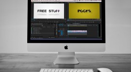
If you need more visual variation, stick with variations within the typeface itself: bold, italic, condensed, black, book, demi, etc. These can be used to add emphasis where necessary, without adding visual clutter by using a million different fonts. That said, don’t go too crazy with variations either. It’s all about simplicity. This goes back to tip #2: If everything has to stand out, nothing will stand out. Image from hulk4598 on Flickr.
4. Pick A High-Quality Font
If you really want your work to have a high production value, go with a well-designed, high-quality font. Pay for it; it’s totally worth it. You normally wouldn’t trust the “free” stock image sites for your best clients, so why do the same with your typefaces?
For those of you that subscribe to Adobe’s Creative Cloud, you’ve got a leg-up on the others. Creative Cloud includes a subscription to Adobe’s awesome TypeKit library (Clay Asbury did a great post about this here). A high quality typeface has had a ton of research, thought, and design put into it. Type designers do this for a living. Trust that they know what they’re doing.
Also, for the love of all that is holy, never stretch text. They made that typeface the way it is for a reason. If you don’t like it, you’ve probably picked the wrong typeface.
5. All-Caps Is Great, Except When It’s Not
Yes, all-caps is frequently used to draw attention to key text and it does a great job of that. But it’s all about balance.
There are many parts of a letterform, so here’s a quick take-away – the parts of a lowercase letter that stick up or hang below the main body (x-height) are what enable us to read easily and quickly. Remember contrast being important? It applies here too. The parts that stick up and down help us super-quickly scan and identify those letters without having to really study the letter. If you use all-caps, you’ve taken that advantage away; every letter is exactly the same height, so your eyes have to stop and identify every letter, one at a time.
Don’t believe me? Type a whole paragraph in all-caps and time yourself reading it. Then find another paragraph of similar length and read it in normal case. Which one is faster, which one hurts your eyes? So yes, all caps can bring emphasis but it also reduces readability. It’s a trade-off, so trade wisely.
Fun aside – did you know that there’s a difference between readability and legibility? Without going into too much detail, legibility is how easy it is to read/identify the letters, readability is how easy it is to read/identify the word(s).
6. Pick & Stick With A Color Palette
Color palettes bring a very pleasant harmony and cohesion to any good design, and motion graphics and titles are no exception. Find one that fits your piece’s mood or use the branded colors of your client (often they’ve had a designer pick scheme that works wonderfully together). Then stick with this color scheme.
You’d be amazed at how a well-planned color scheme can give a design a sense of polish and energy. Two great resources for finding palettes are ColourLovers.com (my personal favorite; you can even search by keywords like mood and feel) or Adobe’s Kuler:

7. White Space Is Okay, I Promise
Don’t feel like you have to fill up every pixel. Empty space (white space) is good. It gives the eye a break, and if you use it well, it leads the eye to exactly what you want the audience to be focusing on. And, no, that logo doesn’t need to be bigger (even though your client may be telling you otherwise). The empty space around it brings attention to it. Let it breathe.
I hope these help polish up your own motion design projects. There are a ton of resources out there for graphic design, and you’ll find that a lot of them help tremendously with motion graphics and title design. So get out there and learn!