5 Easy Tips For Creating an Awesome Title Sequence

Grab your audience from the get-go with a perfectly executed title sequence!
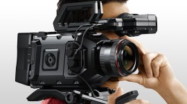
In terms of production value, the difference between a project shot for $10,000 and one shot for $1,000,000 isn’t all that different any more. Cameras like the RED EPIC DRAGON have opened up the ability for low budget filmmakers to create final products that can rival productions with many times their budget.
Yet, no matter how good the camera tech gets, there are always going to be certain elements that can give away a low budget film – one of which is the opening title sequence. Most commonly, low budget films make one of two choices when it comes to their opening titles. They will either:
A) Go overboard and attempt to create a heavily animated After Effects style title sequence, or…
B) Will keep things simple and overlay text on the edit itself, or on a black background.

Unless you are a professional After Effects artist, I would always recommend going with option B. Attempting to create an elaborate title sequence by yourself will not work 99% of the time, and the vast majority of projects simply don’t need it. In fact, the current trend today with films of all sizes is leaning towards fewer titles (if any) up front, and going for a more minimalistic approach with regards to the design.
While there is no such thing as a one size fits all solution for any creative choice, I do recommend following these 5 tips which will keep you basic titles looking clean and professional:
1. Keep the font small.
One of my biggest pet peeves is watching the title sequence of an independent film, only to be completely thrown off by awkwardly sized titles. There is no reason to have opening titles take up half of your screen real estate, and unless you are intentionally going for a certain look (such as block text that covers almost the whole screen), keep your titles nice and small.
I recommend finding a size that is just comfortable enough to read without squinting your eyes, but not much bigger than that. The main title card with the film’s name is the exception to this rule, and you can always have that title appear much larger so it stands out from the rest. However, for any and all other titles, small is almost always better – so never up your font size unless absolutely necessary.
2. Choose a tasteful font.
This one is going to sound like a no-brainer, but one of the biggest faux-pas that I see with regards to titles are really poor font choices. I highly advise not using any textured fonts. In other words, fonts that have a grungy or spray painted look (or anything else overly stylized) can look very cheap.
Again, there are exceptions to this rule as well, but typically clean and simple fonts will always work better. Keep in mind that if your film is successful, it will hopefully be seen for many years to come. So, the last thing you want is to get stuck with a font that ends up dating your movie.
While not specifically focused on filmmaking, here’s a great roundup from Grantland’s Rembert Browne that explores the hilariously dated universe of 90s sitcom openings.
3. Don’t animate the titles.
A few years ago, a trend started that involved animating titles to match the picture. So, for example, there might be a shot of a bus crossing the screen, and then the titles might follow along behind it. This fad has largely died off, yet so many indie filmmakers are still attempting to animate their titles to elements on the screen in hopes that it will add some production value.
Simple is always better in my opinion, and 9 times out of 10, you are going to be better off just fading in a static title over picture (or black) than animating it to achieve an unoriginal effect.
4. Use framing guides.
I can tell from a mile away when an editor hasn’t used framing guides with their titles. One title will fade into the next and they will just be slightly off from each other. Or a main title that is supposed to be centered will feel like it’s off to one side or the other.
It takes you practically no time to turn on your framing guides and snap your titles to the right position on the screen, so whatever you do, please make sure you don’t skimp out on this step.
5. Avoid drop shadows.
I mentioned above that certain font choices can really date the look of your film, and the use of drop shadows can pose the same issue. Drop shadows can look okay in certain circumstances, especially when they are part of the overall aesthetic of the film’s brand, however they should never be used simply because the text needs to stand out more.
For example, if you are trying to put one of your title cards on a shot that has a high contrast background, and the title isn’t showing up properly – you might be tempted to add a drop shadow. This is the logical thing to do, but at the same time it will change the overall feel of your titles. If you absolutely have to use drop shadows, then go for it – but just make sure that you use them across the board on all of your titles so at least there is a sense of consistency.
Interested in reading more about the art of the title sequence? Check out these articles from the PremiumBeat blog.
- Creative Inspiration: The History of the Title Sequence
- Create a ‘True Detectives’ Style Title Sequence in After Effects
- Cinema 4D Tutorial: Create Animated Title Sequences
What are some of your favorite movie title sequences? What’s the secret to making a title sequence stand out? Let’s discuss in the comments below.