How to Avoid Sepia Looks While Warming up Footage in Post

When warming up footage in post, many inexperienced colorists will take a wrong turn and wind up giving their footage a sepia look. Here’s how to avoid that issue entirely.
It’s surprisingly common to find poorly colored independent films that inadvertently feature sepia-like tones in many scenes. This is almost always a result of poor technique in the color suite — and can scream amateur to any audience with a trained eye.
More often than not, this issue is a result of pushing too much warmth into an image while color grading (in the shadows, mids, and highlights) and then desaturating the image afterwards — usually in an attempt to offset the overdone color work. This is a perfect recipe for a sepia look (if that’s what you’re going for) but a very poor approach to adding warmth to your image in a more general sense.
In order to achieve a more natural warm look in your shots (without completely draining your footage of any other tones or colors) these are the steps you need to take:
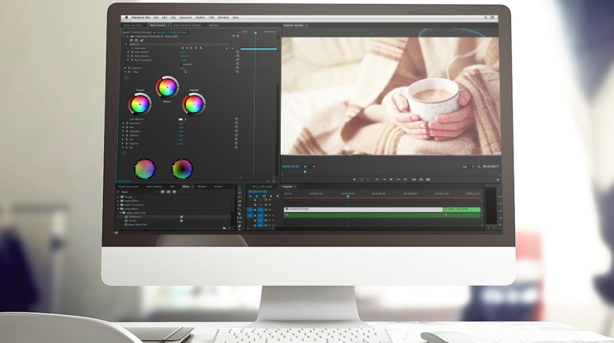
1. Balance Your Image

This rule applies in color grading no matter what look you’re after: always balance your image before adding any sort of look to it. If you neglect this step, you’re already going to start off on the wrong foot and it will be hard (if not impossible) to recover from.
Keep your eye on the scopes as you adjust your color wheels to a point where you have an evenly balanced image. At this point you aren’t going for any type of creative look. You’re simply looking for a neutral starting point from which you can continue to build.
2. Warm up the Midtones

I always recommend starting your creative grading process off by warming up the mids. Doing so will give you a far more pleasing result when compared to pushing warmth into the shadows — or even worse, applying warmth globally to the whole image.
There are certainly times when you should be warming up your shadows, but if you are working from a neutral starting point, warming up the mids first will set you in a much better direction. Doing so will add warmth to the areas you notice most (skin tones) but will leave the shadows and highlights cooler, which will help you maintain a nice amount of color contrast in your image.
3. Tweak Your Shadows and Highlights
Depending on how far (or not) you pushed your mids, you’ll likely need to adjust your shadows and highlights to complement whatever changes have been made so far. For instance, if you pushed a little too much warmth into the mids, it may have had a residual effect on your shadows/highlights, in which case you’ll want to cool them off. With that in mind, be sure not to push your shadows too far in the cool direction.
Unless you want a Transformers-esque blockbuster look with blue shadows and orange highlights, be very slight with your adjustments in the shadow department. Always be looking to neutralize them, not stylize them.
4. Adjust Saturation

By now your image should be most of the way there. You should have a nice warm look from the adjustments made in step two, and the fine tuning you accomplished in step three should have helped add a noticeable amount of color contrast. All that’s really left is to adjust your saturation level to help everything blend in a little bit more. Depending on how saturated your image was to begin with, you may either need to dial your saturation up or down to get things looking just right. Nine times out of ten, I find dialing it down just slightly is the way to go.
With that said, be weary if you feel like you need to push it way down in order to make the image look right. If that’s the case, there’s a good chance you have pushed things too far in steps two or three and might need to go back to the drawing board.
Got any color grading tricks to share? Let us know in the comments below.