Instagram Looks in DaVinci Resolve: Part 1

Popular photo-manipulation apps like Instagram have built-in filters to jazz up normally mundane shots. These looks can be created in DaVinci Resolve, giving your video projects a hip, trendy feel.
The more distinct looks are all about tinting sections of the image in unconventional ways. A look is imposed onto the image, giving it a deliberate aesthetic viewpoint that edges it away from normalcy. Contaminating the shadows, mids, or highlights with anomalous color creates highly stylized looks that are very much in vogue right now, thanks to Instagram. In this two-part post, we’ll look into creating several of them.
The Reference Images
We’ll start with reference images of the palette we want and then impose that color scheme on a new photo. This will show us that a wide variety of looks can be dialed into a single shot given an array of reference material. Clients come into sessions wanting to see more extreme types of looks all the time, so it’s important for the colorist to be able to “read” the reference image and adapt it to the project at hand.
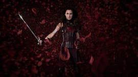
Here are the looks we’ll be recreating (images courtesy of Shutterstock):

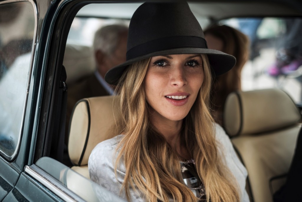
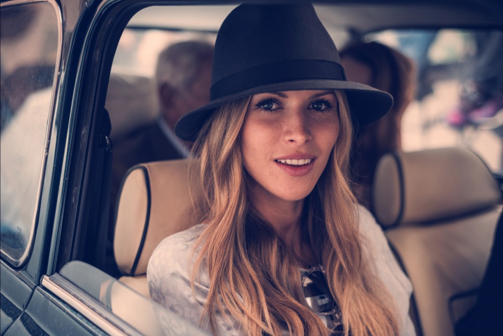
The image we’ll be applying our looks to is a favorite of mine, an image of a smiling woman in a car. The image has a nice initial exposure with sharp focus and intact upper and lower registers.

Let’s perform an initial balance on our image. The blacks are lifted in the original shot, so I’ve brought them down to around zero IRE and raised the mids to compensate for the resulting darkness. The whites in the background seem fine, but they’re a touch off so I’ve white-balanced for exact white. The image’s saturation feels fine, so I don’t affect that at all.
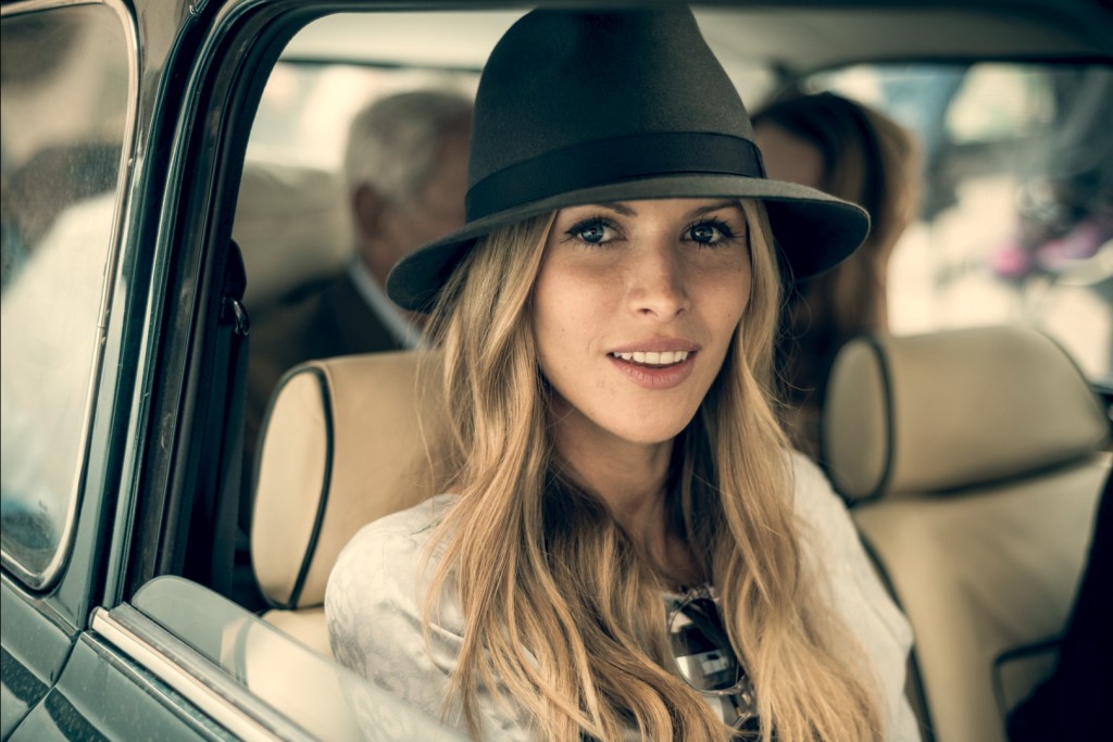
Here’s the initial balance. It’s pretty basic; I haven’t touched the image too much aside from crushing the blacks and compensating for the darkness in the midtones somewhat.
Approaching the Instagram-Style Grade
Vintage images are often characterized by their lack of color correction. The unprocessed nature of vintage images give them their distinct look, hearkening to a time before color correction and deliberate image filtration were so readily available to mass audiences.
An image search for Polaroid images often yields the presence of color tints in the shadows and highlights. The overall image may have a color cast and natural vignetting could be present. Correcting to lessen these effects is the usual strategy, but in this case, we’re going to enhance them. Don’t worry, the irony that we’re now using color manipulation to get back to an uncorrected look is not lost on me.
We’ll see that a big contributor to our modern Instagram looks are their tinted blacks, and to a lesser degree, tinted whites, and skewed midtones. Black is important because it provides a reference point for the eye. When you remove that reference, a lack of cognitive reconciliation occurs and the image becomes more complex to us from a color standpoint.
Reverse-Engineer Your Reference
When deconstructing these looks, it’s instructive to reverse-engineer them by looking for clues in your scopes. Knowing how to read scopes will give the look away, making it easier for us to recreate it. When the three channels of the parade view are at the same level in the whites or blacks, we say they’re balanced. A balanced image is a great starting point for most projects because they can be swung in many directions. If the values are raised in one or several of the channels, color contamination is at work. For our deliberately processed Instagram-style looks, this is what we’re going for. Let’s try it with our first image.
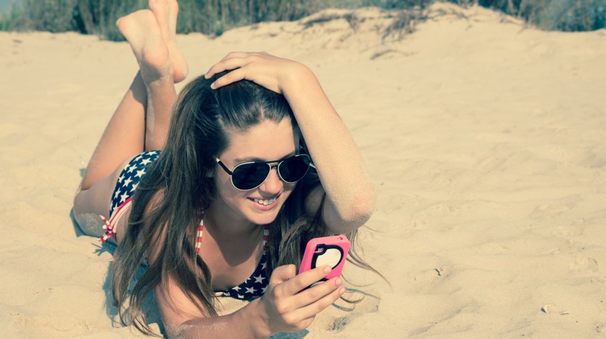
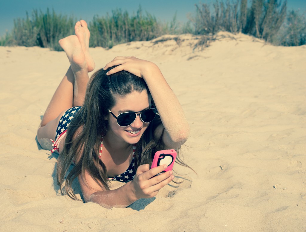
The First Look: Texting in the Sun
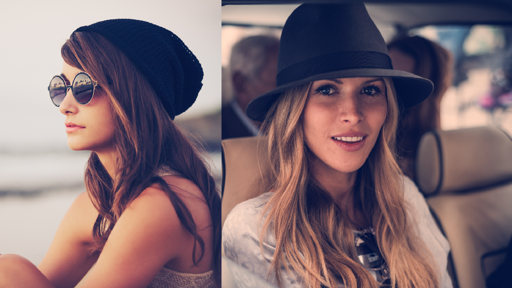
Did someone say #beach?
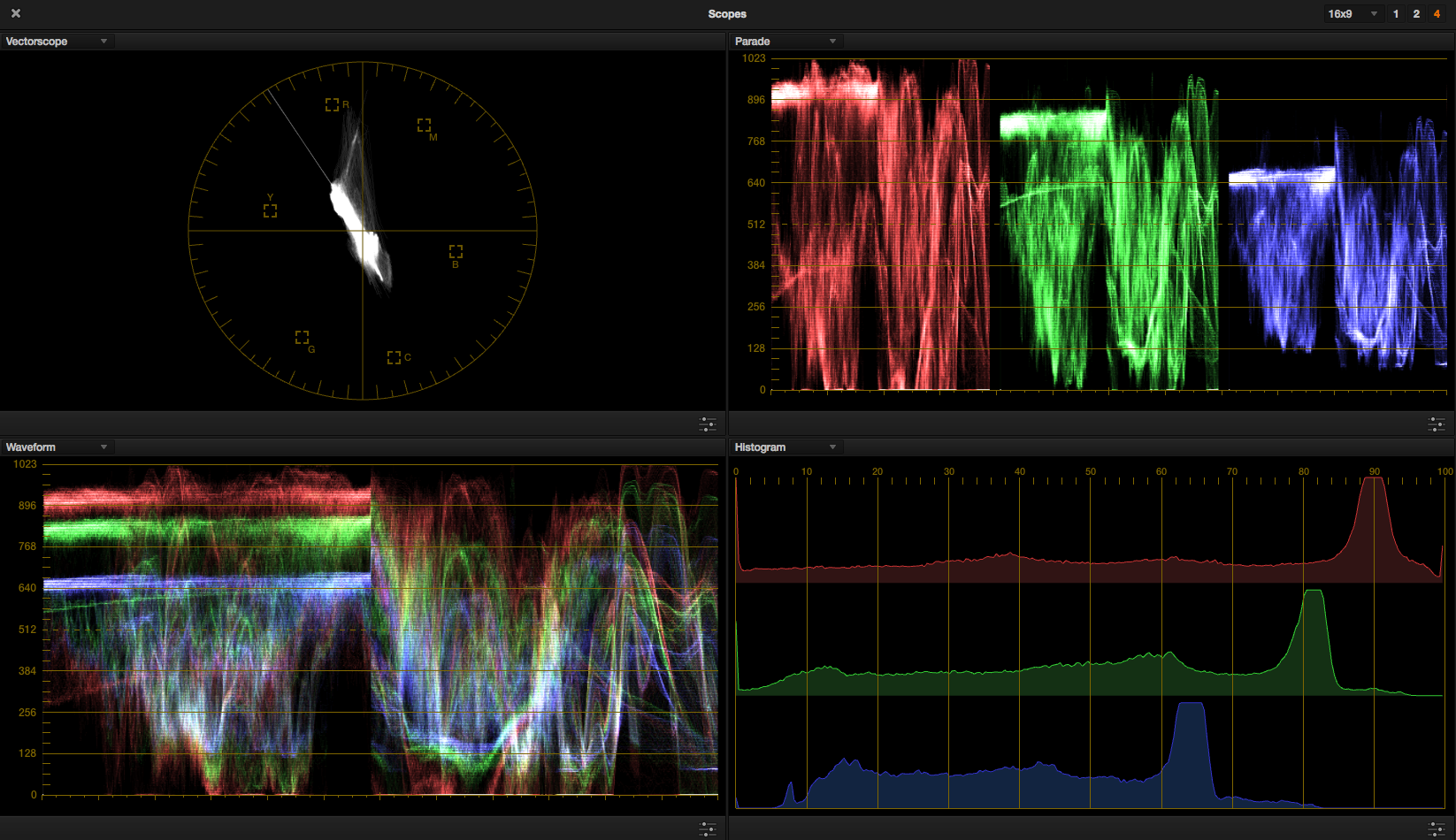
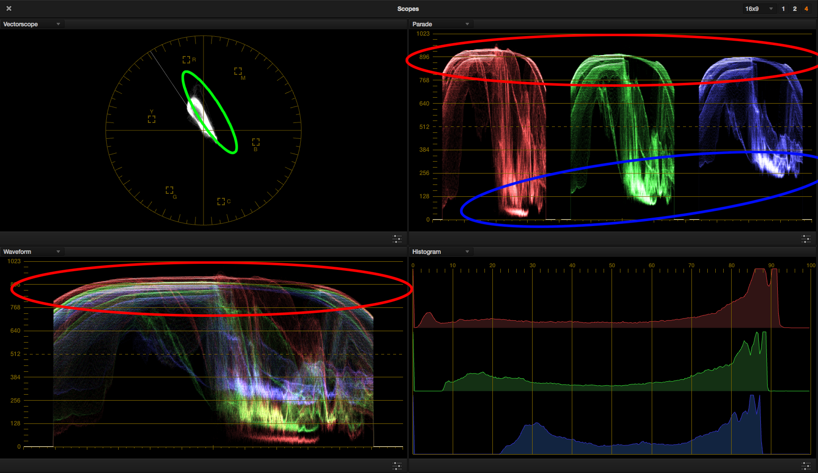
Let’s figure out what’s going on with the girl on the beach and apply them to the woman in the car. From our scopes, we see one of the biggest characteristics contributing to this look is the tonal quality of the blacks, which have been skewed towards always-popular cyan-blue. We can tell this by observing that the blue channel is elevated higher than the red and green channels. The whites are also cranked warmer, indicated by an increased red relative to the green and blue channels.
The blue circle shows us precisely how much the blues are lifted. The red circles show us there’s a bias toward warm highlights.

Grab a still of your beach girl reference image and set it against the woman in the car. The scopes will show their values side by side, allowing you to precisely match the two shots. Play around with the shadows until they’re matched to the exact tint of cyan-blue in the blacks. This already gets you pretty close to achieving the look. Remember when I said the blacks were important?
Next dial in the highlights by introducing more red until the scopes from the two shots match. You will likely need to keep correcting for the shadows region as you play around with the mids and highs.
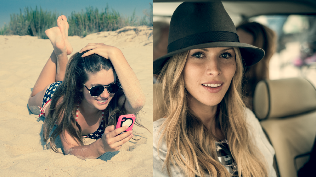
Here’s the new look on its own.
A side-by-side comparison.
The scopes for the two images next to each other. One image ends and the other begins right at the center of the image, allowing us to match sections of the image with greater ease. When the traces in the scopes line up in the shadows and highlights, you’ve matched your shot.
Here’s the answer key for where I wound up with my primary correction.

Despite the shots differing in image quality, time of day, and likely the lensing and camera model, we can get them into the same world with just a single primary correction and continue tweaking with secondaries to edge them even closer.
The Second Look – Pensive Yearning on the Shore
Why won’t he text me back?
Let’s continue to train our eyes by evaluating the second image just through the scopes. They show tons of purple and blue in the blacks and mids, and the highlights have been swung slightly yellow.
I find the parade most useful for seeing where there’s a color offset, denoted here by me by the blue and red circles. The green circle in the vectorscope informs us that the image is skewing toward magenta.
To achieve this style on our woman in the car, begin by pushing magenta-blue into the blacks. The image becomes a little milky, so it may be necessary to crush the blacks overall as the right level of magenta-blue is reached. Next let’s feed a bit of magenta into the overall image and swing the highlights a bit yellow, matching the values in our reference image. I dig this look.
Hello, look number two.
A comparison of the two images. Note that you may have to match different elements of the shot to make things line up. For this example, in the reference image, the girl’s shoulder is closer to the car woman’s face and the sky on the left matches the car woman’s shirt.
The scopes readout of the above.

The color wheels answer key. Note that this look was pushed more, particularly in the blacks, than the first example.

In Part 2 of this post, we’ll look at a couple of Instagram looks that are a bit more subtle. Stay tuned!
Show us your looks in the comments.