Instagram Looks in DaVinci Resolve: Part 2
Here’s Part 2 of our peek into using DaVinci Resolve to get retro-cool Instagram looks.
In part one of the Instagram looks post, we analyzed two rather extreme styles. This time, let’s investigate two more subtle styles.
All of the images used in this tutorial are from Shutterstock.
The Third Look – Pagan Princess

Last time we worked with a magenta-heavy grade. Magenta is a fashion-friendly color since it helps to create pleasing skin tones. Magenta’s complement, green, tends to be shied away from. To many, green can make the skin look too sickly and drained of blood.
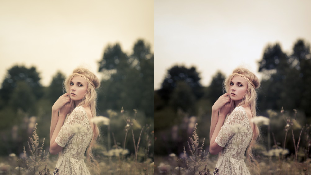
The image of the girl in the field flies in the face of that. The shot is dominated by yellow and green and yet is pleasing to the eye. I like the creative’s choice to not taking the typical route. The shot’s palette doesn’t hide from the tones of the natural scene.
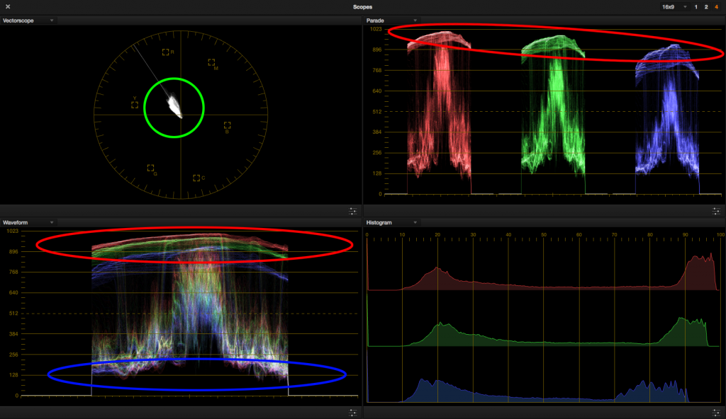
Let’s bring the image into Resolve and analyze what’s going on. Most of the image’s trace veers into yellow and green. The skin tones haven’t gone off the deep end into green. They’re pegging at a nice, creamy yellow. The highlights are warmer, but don’t contain as much red as in our other examples. The blacks are lifted and are tinted only slightly toward green.
From what’s circled in red, we observe the highlights are warmed up a bit. The blue circle shows us the black level and its tint. Looking at the vectorscope (green circle) shows us the image is somewhat desaturated. We’ll use all this information to match to our reference image.
Balancing and lifting for the blacks gets us some of the way there, but most of this look is in the midtones and highlights. Careful nudging of the mids towards yellow-green, along with desaturating overall, solidifies this look. The reference image contains low contrast so we won’t modify it too much, although I did brighten the midtones to better approximate the outside lighting present in the reference image.
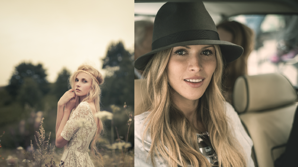
Our resultant grade. It’s a subtle one, but not every project calls for an extreme look.
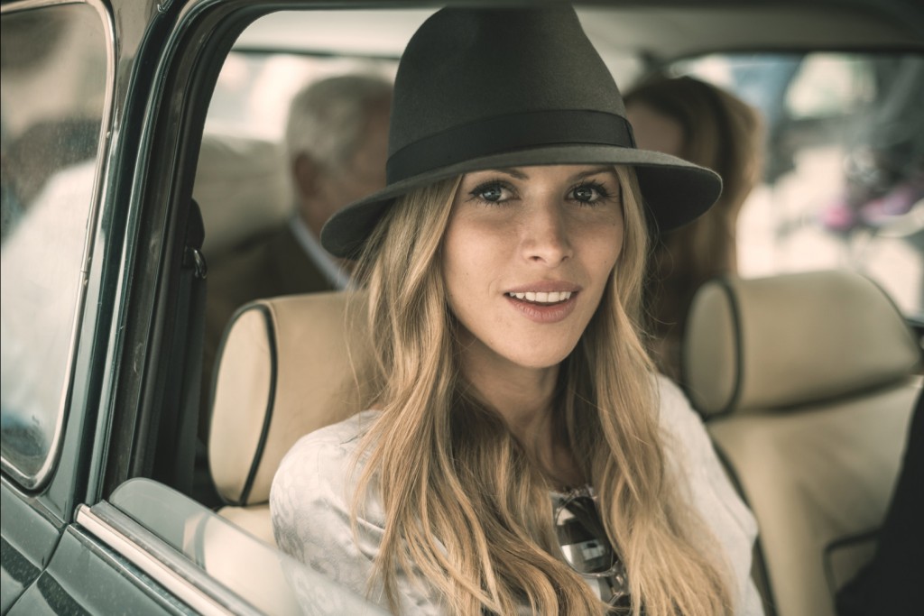
A comparison of the two images. In my secondaries I would probably lift up the car woman’s face to better match the outdoor lighting environment of the reference still.
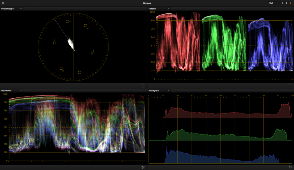
The scopes of the two images side by side.
The color wheel answer key. Note how much more needed to happen in the mids and highs to pull off this look.
The Fourth Look – Girl in the Reeds
Has anyone seen my puppy?
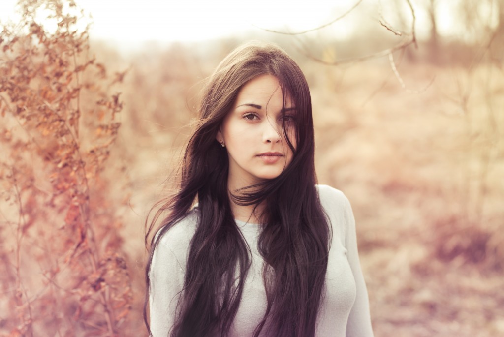
The girl in the reeds has again been tinted in the blacks (seeing a pattern?) and lifted to give the look a breezy feeling, perhaps imitating the billowing wind blowing her hair around.
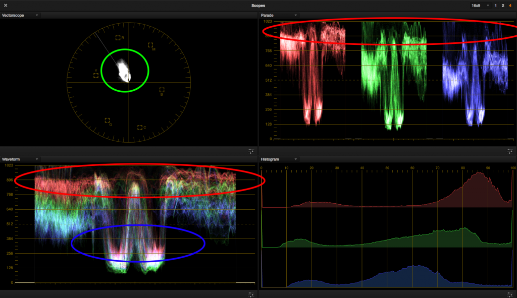
Reading the scopes, a magenta tint has been introduced in the shadows, evidenced by the red channel being lifted the highest on the parade. The whitest parts of the image have been intentionally clipped, which will play into our grade later. Though it’s harder to see where the highlights have been skewed, via the vectorscope we can observe that most of the image has been warmed up into red-yellow, with few if any values sitting in the blue region.
The shadows are showing a bias toward magenta (blue circle). Even though the whites are clipped, there’s warmth in there (red circles). The green circle shows the overall tone of the image and an idea for the overall saturation.
The sky in the reference image determines where to set the white point. Though the whites are clipped, there is a faint warm tone in the sky, evidenced by a bias in the red channel on the upper register. We can use the vectorscope to get a sense of where the midtones should sit by gradually moving the car woman shot into the blob of the vectorscope.
Let the image clip out in the highlights to complete your primary correction. The image is somewhat desaturated, although not as much as the previous example, so adjust by watching the vectorscope as well. Lift the mids a bit more since the inside of the car is a bit dark, and we should be there.
Here’s our woman in the car with her girl-in-the-reeds look. Warm, lifted, breezy.
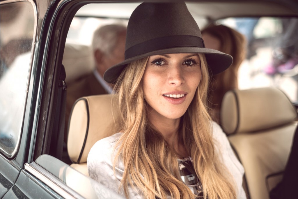
Side by side with our two ladies. The reference image, while clipped in the whites, can still be corrected for.

The scope comparisons between both images. Note that I chose to clip out the woman in the car more than the other setups, which starts to be seen on her right cheek. I wouldn’t risk the skin tones much more than this.
The answer key. It’s a pretty subtle grade, but it shows how it doesn’t take much to give a shot a different emotional impact.
Reverse-Engineering, Revisited
When I was developing my colorist skills, I really wanted to know how to make certain looks that I saw on TV, in movies and magazines. I’d bring extremely processed images into an image-correcting software and return them to a baseline correction to find out what the artist did.
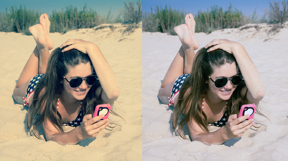
Just for fun (and yes, this counts as fun for me) I’ve corrected the four reference images to approximate what they may have looked like at the time of shooting. In this way the beginning colorist can toggle the grades to see how far the extreme look has come. Seeing both versions side by side can develop your aesthetic sense to see why a creative has chosen to swing the image a certain way.
I hope you’ve enjoyed this two-part post on getting Instagram looks in DaVinci Resolve, but it doesn’t need to end there. Here are a few more DaVinci tutorials in the world of color grading:
- Color Grading: Bleach Bypass Looks in DaVinci Resolve
- Sunkissed and Sepia Looks in DaVinci Resolve
- Popular Fashion Looks in DaVinci Resolve
If you’re interested in seeing detailed analyses of more looks, just let us know in the comments.


