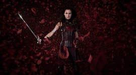
Popular Fashion Looks in Resolve

In this tutorial we take cues from fashion and glamor print and apply them to video in DaVinci Resolve.
As a colorist specializing in fashion and beauty work, I’m constantly cross-referencing still images from fashion magazine editorials to inform the polished look that has become synonymous with glamour. When asked to think beyond a generic look of healthy contrast and color saturation, I employ a few techniques that have been ported from Photoshop and brought into the moving image realm.
Skin tones, skin tones, skin tones
The majority of my job involves addressing client concerns as quickly as they are mentioned, maintaining consistency across scenes, and retaining healthy skin tones. I regularly get to the suite early to begin on an overall grade before the client comes in, but if I have a few minutes more and the spot centers around predominantly female talent, I pull skin tone keys for each shot beforehand as well.
To illustrate some concepts, I’ll be working off the following image from Shutterstock.
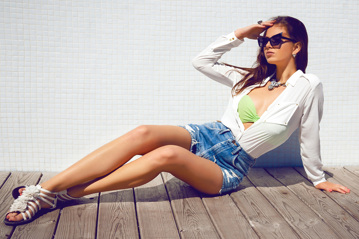
In the original, note that there are quite a lot of blues in the shadows. I’ve corrected for that in the second image to give us a neutral starting point. If this isn’t something you noticed, toggling between the two images will certainly make this more apparent.

Here are the Resolve dials for my balanced image. When I corrected for the blacks and whites, the image looked a little yellow so I’ve swung the gamma accordingly:
 :
:
Adjusting skin tones while in session is similar to being at the optometrist’s office: she’ll ask if you like option A or B better, with only a hair of difference between them. In a color session it’s par for the course to adjust skin by minute amounts and then toggle between them for the client to choose. Often the adjustment I make is to swing the hue of the keyed skin toward magenta. The slight adjustment is often enough to please the client, who may be thinking the skin feels too green or yellow. You could also adjust the shadows in the keyed skin in a similar way, skewing them towards a more magenta tone or lifting them just slightly.


The tweaked skin tones and the key I pulled on the skin to separate it from the rest of the image. Sure enough, I increased the hue, skewing the skin toward magenta by a hair. Lifted skin is a common technique in fashion, but don’t go too far or the effect will break down, particularly in DSLR footage.

The control panels I use on gigs have been tweaked for sensitivity in Resolve’s preferences. I know how much a rotation of a ring will adjust my key if I give it a big swing. If I’m working with material that was shot on a high-quality medium like the Alexa, I know that I can actually lift the skintones in the mids or highlights without introducing digital artifacting that looks like ants are crawling over the image. If you don’t know what I’m talking about, try pulling a key on something and pushing the mids or highs more than a stop or two, or do so with an imperfect key. You’ll witness the unpleasant effect very quickly.
These artifacts are a product of the resolutions we’re dealing with today. This’ll get better in time, and it’ll be really interesting to see how far we can push footage in five years.
Approaching the Looks
While fashion editorials employ a wide variety of looks, it is prudent to note that most of the distinctive look is done before post, in the actual mise-en-scène of the shot. As colorists we’re working with a preexisting canvas that ideally has already gotten us much of the way there.
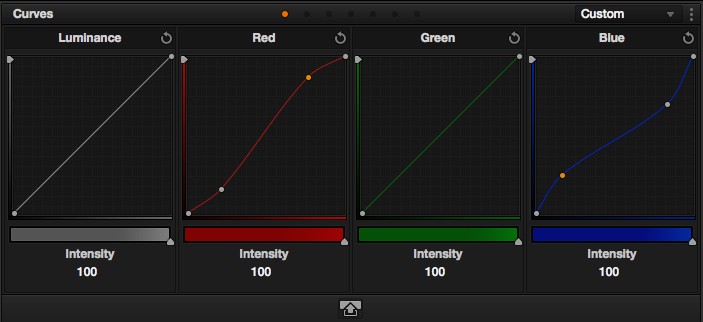
I believe that to execute looks that appeal to fashion sensibilities, we have to think a bit like photographers and their tool of choice, Photoshop. To colorize an image in Photoshop, many photographers use a Curves adjustment layer. We’ve got this tool in Resolve too.
The first step here is disable Gang Custom Curves in the drop-down menu of our Curves tab. This will enable us to affect each curve separately, and to play each channel against each other for some interesting looks.
Adjusting the luminance curve will add or subtract contrast. Try adding two points to the curve, one 20% or so from the absolute shadows and one 20% from the highest region of the curve. Now stretch the points so the curve looks like an S.

Inverting the S-curve decreases contrast, so play around with what suits your image the best.
The same concept applies to each of the three color channels. Adding and raising a point near the bottom of the red graph, for example, will increase red in the shadows of the image.
One last note: while of course there are no set rules toward creating specific fashion looks, many times you will find yourself staying away from the green channel entirely, due to the fact that working with it doesn’t tend to yield great-looking skin tones. If you’re trying to create a less traditional look though, by all means, go nuts on the green channel.
Two Specific Looks
Now for some specific looks. Many of the stock fashion looks are derived from simple manipulations of the red and blue curves. The first involves pumping the red shadows and lessening the red highlights, while doing the reverse in blue: diminishing the blue shadows and increasing the blue highlights.


We can also invert those curves for our second look. Decrease red shadows, increase red highlights, increase blue shadows, lessen blue highlights.

In fashion photography there is a great amount of finesse and layering that goes into producing the striking images that grace high-end fashion publications, but these looks will get you going toward them for sure. As an experiment, visit the site of your favorite fashion publication and see how many looks you can replicate by swinging the curves around.
Again, it’s important to reiterate that much of what makes a photograph categorized as fashion is largely based on its mise-en-scène. It’s all about the model and her pose, the clothing, scenery, makeup, as well as an extremely high acuity to perfecting very small details. An odd fabric crease or skin blemish betrays the perfection that fashion imagery strives for. Color correction is only one component of this scrutiny, and no amount of blues in the shadows will solve an image that doesn’t have this level of consideration at the time of image capture.