Sunkissed and Sepia Looks in DaVinci Resolve

A golden, sunkissed look is something all colorists should have in their toolbox.
Let’s break down what the ‘sunkissed’ look entails and pull it off in a few different ways in Blackmagic’s DaVinci Resolve. We’ll also talk about applying a sepia tone grade that’s similar but has its own specific look.
Approaching the Grade
A sunkissed look, as one would imagine, is going to be skewed to the warmer side. However, we don’t just want to swing the blacks, mids, and highlights warm and call it a day. Sure, this is one way to go, but subtlety and nuance can also be employed to great effect. Depending on the source footage, the image may be highlight-dominant if it’s directed toward the sky. Or, the shot may contain lifted blacks, cueing us toward a look that is more slight. It’s contingent on how extreme of a look you want to impose on the image.
First, correct each shot in the timeline so that it looks balanced. This promotes consistency, giving you a more uniform place from which to start with each shot in the timeline. Once there you can exert a grade on every shot and make more minor adjustments to bring the shots to one level of uniformity. If you apply an extreme look right away, you may neglect small details of the shot that are getting lost due to an extreme grade. You might get lost in a sea of yellow.
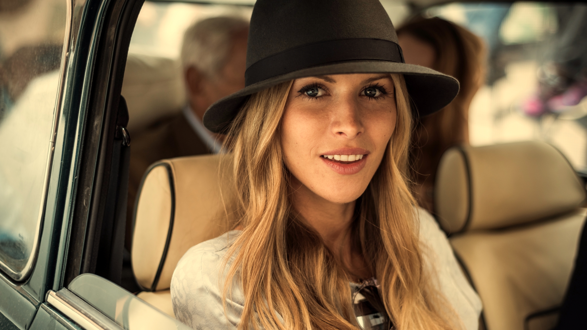
The original image, courtesy of Shutterstock:

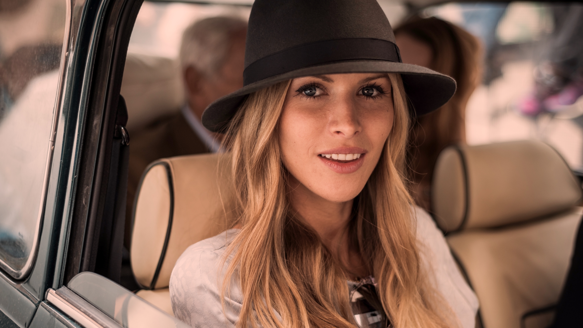
My initial correction. Note the blacks were lifted. I made them a more true black and brightened up the image slightly:

After your initial balance, push some yellow, orange or even red into the highlights. Note how even as different colors are put into the highlights, the effect can be quite pleasing to the eye. There are often many correct answers (or no wrong answers). It often comes down to the aesthetic of the creatives involved. In my image, I’ve had to compensate for the highlights which begin to clip in the red channel as the green and blue highlights diminish.
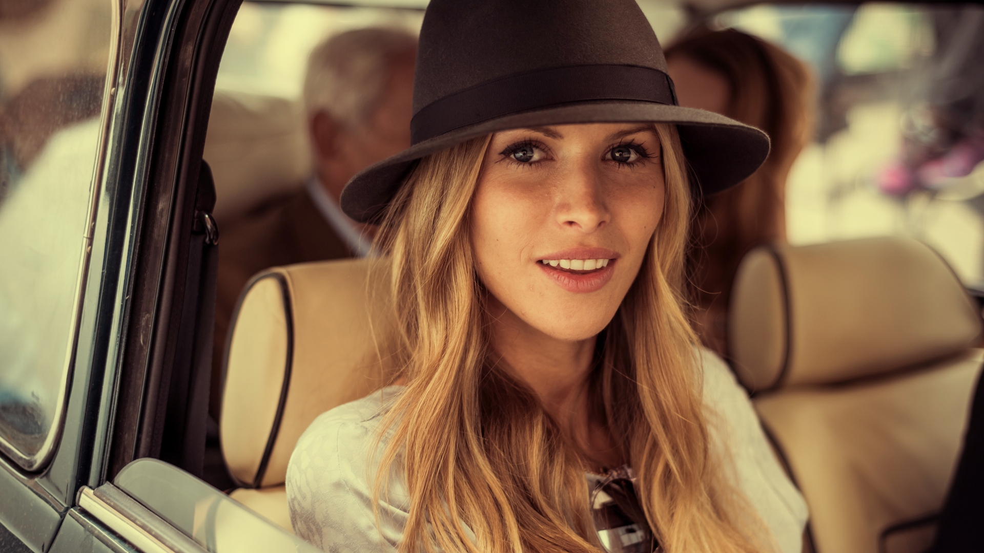
From the balanced image, just adding a bit of orange to the highlights:

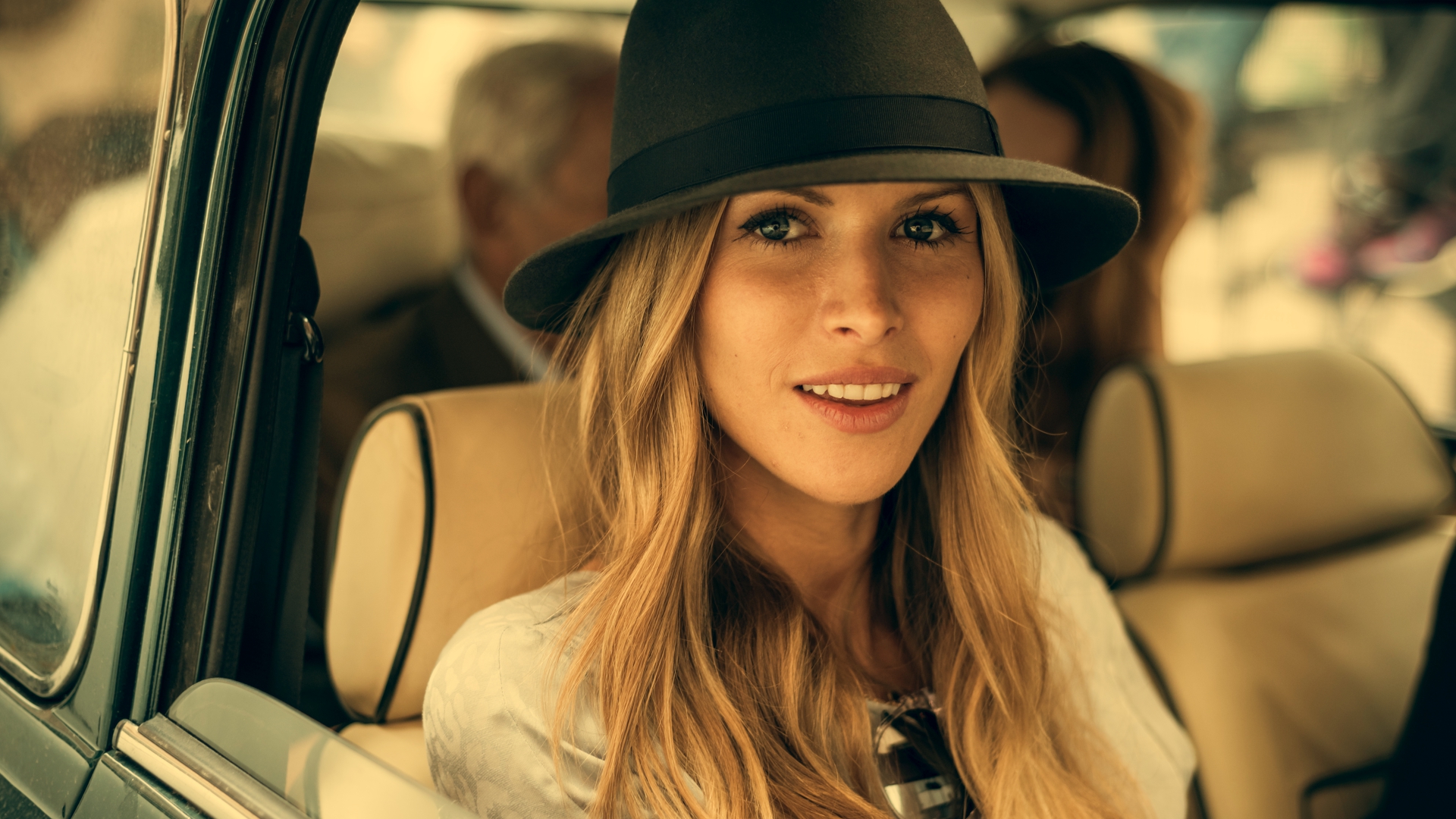
Adding yellow to the highlights. I like this better than the first:
Magenta in the highlights suggests the sun going down. Not sure it works so well with this one but it’s certainly an option for a client who likes this tone in the skin:
Pushing warmth into the highlights may be enough to deem this a sunny look, but let’s take it further. Slowly swing the mids in the same direction. Take heed of what’s happening to the highlights as you do this. Based on your level of severity you may want to back the highlights from where you had them, as you may find the image is becoming too monochromatic. Experiment with playing different colors against each other, for example yellow in the highlights and magenta in the mids.
Playing some green mids against yellow highlights achieves this look:

Moving the mids towards magenta made me want to swing the highlights toward a bit of green. Yet another way to go:
While you’re doing this, watch how your moves are affecting the shadows. Another thing to try is to put always-popular blues in the blacks, or try adding some green for a less expected look. Though there will still be warmth in the mids and highs, adding blue as opposed to green may make your image look too clean when you’re looking to have the sun dominate the image a bit.
Blues in the blacks against an image with a bit more orange in it is pleasing:

A more yellow image might benefit from some green in the blacks:
You may also want to go for a look that incorporates lifted and tinted blacks. Due to the sun’s brightness, it’s acceptable to not have defined blacks, particularly if the sun is in the shot and is creating a flare in the lens. Whatever tint you put in the blacks will become pronounced, so move in small steps until you go too far, then notch it back a bit.
Lifted, tinted blacks create a more airy look:

Utilizing Desaturation to Push Looks Further
We haven’t talked about saturation yet. When you’ve got the colors where you want for the moment, experiment with both saturating and desaturating and see what it does to the image. You may have pushed the warmth to the brink already, at which point saturating further may not be the way to go. Desaturation will allow you to push the warmth even more, allowing the grade to really dominate the image. The inherent colors of the image will have less of an impact. Adding saturation does the opposite. It may seem a little violent to impose your grade on the natural colors of an image, but certain projects call for radical, edgy grades. Just make sure your client is on board.
A desaturated image allows the colorist to impose more of the colors on the grade. Much of the original colors have been drained out of this version. Just a tad bit of green exists in the car door:

Color Grading: Sepia
An extreme saturation value of less than 15 in Resolve approaches a sepia look. A true sepia look is monochromatic, so desaturate completely if that’s the vintage look you’re going for, then add a new serial node and push warmth back into the image toward about 10 o’clock on your color wheels.
Lastly, our sepia look:

Now you’ve got a ton of sunny looks to share with your client. I hope you’ll see that with this wide variety of looks, there is a great amount of nuance in color grading, even if the client simply wants a warm image.
Share your summer-tinged stills and videos with us in the comments!