Blockbuster Looks in DaVinci Resolve: Transformers

The Transformers franchise helped usher in the era of the Teal and Orange color palette. Here’s how to achieve Hollywood’s go-to look in DaVinci Resolve.
Color palettes in movies are subject to stylistic shifts just like wardrobe, editing style, or actor choices. Recently, many Hollywood movies have trended toward specific color palettes so that viewers are left remembering their unique visual style. Let’s take a look at one of these looks in our favorite color grading software, Davinci Resolve.
Approaching the Grade
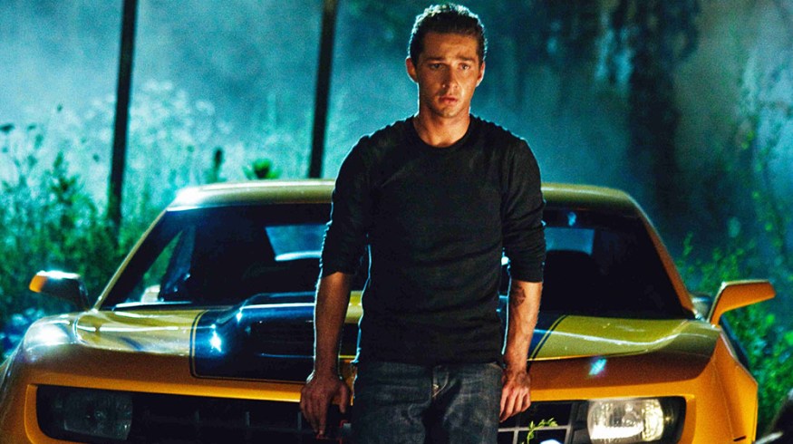
The current popular look for major Hollywood movies adds blue to the shadows and orange into the midtones and/or the highlights. Orange and blue are complementary colors, so when their values are enhanced, a natural color separation occurs that is pleasing. This look has been employed on dozens of Hollywood movies, one of the first and most recognizable being Transformers. It’s interesting to observe how extreme this look had gotten by the time of its sequel.
Let’s begin by balancing the image. This will quicken your coloring chops but will also achieve a level of consistency across all shots in the timeline before extreme grades are applied.
Our original image. It’s a bit flat, but that’s exactly why we’ll perform our primary balancing correction.

Here’s my balance of the image. I’ve given the image a nice, even exposure without pushing the saturation too much.

Here’s where I netted out on the primary corrections.

After balancing our shot, create a new node and introduce blue into the blacks. You’ll see the lower end of the parade climb in the blues while staying relatively constant in the red and green channels. For practice, grab a still from your favorite Hollywood movie that employs this look. You can read the parade to determine how much blue, and at what exact hue, is tinting the image.
When blue is added to the blacks, the lower register in the parade is lifted. You can use this fact to “read” many shots from your favorite movies to emulate their looks.

If you put too much of any color into the shadows of an image, it may start to look “milky.” Play around with using more of a teal, then a green, and maybe even a slight magenta hue in the blacks and see what that does for you aesthetically. Adjust the saturation to taste if the blues in the blacks are too much, and infuse some orange or yellow tones into the midtones.
Here’s the resulting look, ready for the red carpet.


Depending on your project, you can limit or increase the extremity of the look. Here I’ve pulled a qualifier on the skin tones and increased the saturation for a more extreme look that many Hollywood movies use this to create a distinct, if slightly unreal, look.
It may look unreal, but this amount of saturation is used to create a look that will be hard to forget.

Looking for a few more DaVinci Resolve tips? PremiumBeat’s got what you want:
- Better Black and White in DaVinci Resolve
- DaVinci Resolve Tutorial: Extreme Color Looks
- DaVinci Resolve Tips: Pull Better Keys
Share your DaVinci Resolve looks with us in the comments below!