DaVinci Resolve Tutorial: Extreme Color Looks
Highly-stylized extreme color looks are easy to nail down through heavy color tinting. Achieve radical color grades with this DaVinci Resolve tutorial.
In a two-part post here and here last month, I took a look at recreating several Instagram-style looks in DaVinci Resolve. These discussions led us to analyze looks that were certainly stylized, but not all that extreme. One day, you may come across a project where your client is open to a more extreme approach. If you do, hug that client and work with them again. Let’s explore some of these looks.
Approaching the Grade
One way to achieve radical grades is by employing heavy color tinting. To encourage a bit of an unrefined look, adjust the control surface sensitivity in the preferences beforehand. A higher sensitivity number will make the trackballs and dials slide around quicker, allowing you to dial in extreme looks fast.
Try setting the RGB balance sensitivities to around 80 and watch the colors get thrown out of whack with the slightest push. It’s like coloring with a fat marker as opposed to a thin pencil. It’s going to get a little messy.
Click the gear icon on the bottom left in Resolve’s interface and select the Control Panel preferences. To see dramatic changes, alter the RGB sensitivities for the lift, gamma and gain to somewhere around 80, out of a maximum value of 100. 
Just for today, throw realism out the window. Let’s abandon natural skin tones in favor of a color treatment that imposes itself on the image. The challenge will still be to make our images look visually interesting.
Executing the Looks
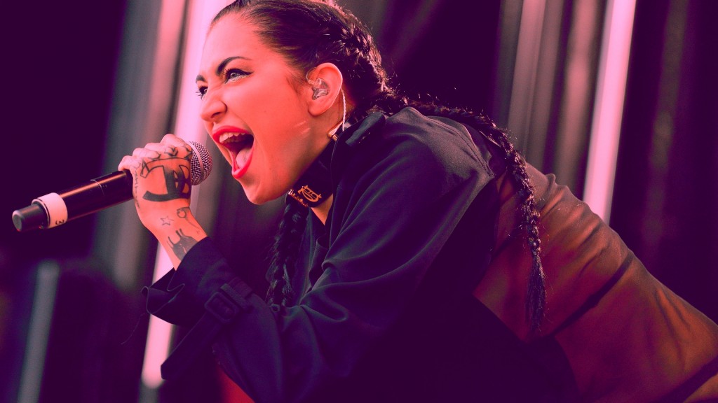
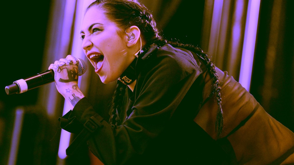
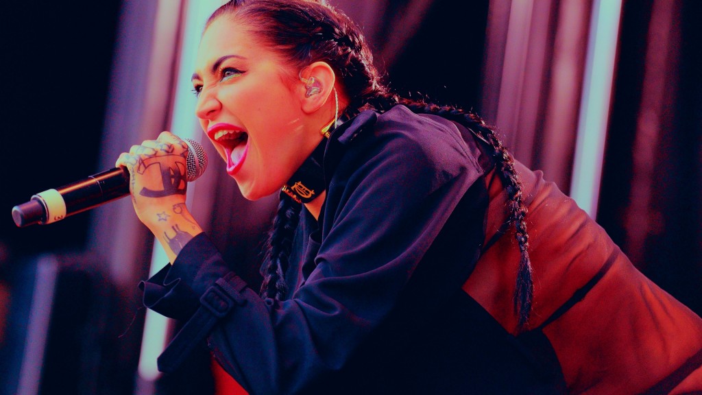
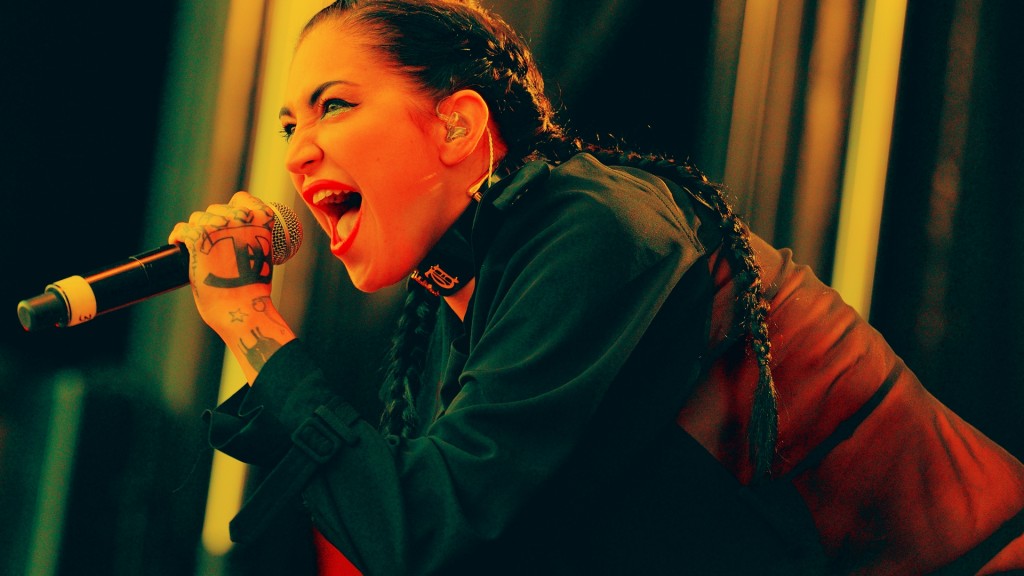
Here’s the image we’ll be working on. I picked it because it is fairly neutral, but mainly because this lady looks awesome. She’s the perfect canvas for some extreme grades.

As always, perform an initial balance on the image, then create a new node for screwing with the colors. Here are some looks I came up with, along with the color wheel “answer keys.”
Depending on the type of image you choose, the colors will react quite differently at the outer limits, but since we’re thinking outside the box, there are really no wrong answers. At such extremes, adjusting the saturation by a smidgen will lead to another look itself, so try that too. Trust your eyes and visual acumen to guide you to what looks good.
Pushing the Concept Further
While we’re not touching the luminance values too much for the purposes of this tutorial, it can be helpful to use luminance to qualify sections of the image in the interest of processing them separately. First, pull just a luminance key on half of the image. To do this, increase luminance Low Clip or decrease luminance High Clip.
When about half of the image appears in the qualification, soften the corresponding Softness control. This will ensure that extreme corrections will still have a smooth falloff in the extreme color ranges.
I’ve pulled the High Clip down on just the luminance, then increased the High Soft enough to gradually recede the correction. Then I created an Outside Node to color the values outside the first node. 
On the newly keyed portion of the image, go crazy with one of the trackballs. When you’ve destroyed the image to your liking, create an Outside Node to invert the qualification and tint that part of the image.
This creates a more controlled look that can be tuned in greater detail. Now that both sides of the shot are tinted, experiment with the qualification point in the original node. The image changes as values are included or excluded. 


To further complicate our look, create another node and qualify a different section of the luminance, maybe this time from the bottom third of the image. Tint that with a different color altogether. Maybe this node could even be desaturated. Now you’ve got a bunch of colors playing against each other in psychedelic glory.
In addition to the luminance split above, I’ve added a third node that selects a more narrow range of luminance values. Then I went wild on everything for a different look altogether. 


Dial it Back
Now that we’ve got a bunch of insane looks, let’s see if we can make them more usable for a traditional job. If you balanced your shot in a separate node at the beginning, you can mix it with the extreme node(s) to bring the look closer to normalcy. To do this, select the Key tab in the lower-middle section of the screen and adjust the Gain parameter underneath the Output heading.
A value of less than one will essentially lower the opacity of the node correction to mix it with the base correction node. Increasing the value of Gain more than one won’t accomplish anything.
Setting the Output Gain to 50% pulls one of our extreme looks back into a more commercial realm.  When you’re destructing your image, keep track of digital degradations. It’s up to you to determine if these are acceptable for your grungy look. If not, consider dialing back your look, as colors in the vectorscope can also clip out. Alternately, try using noise reduction or soft clipping to limit the amount or severity of artifacts.
Yikes! This is what clipped colors in the vectorscope look like. Yeah, you can slice colors too, just like whites are sawed off on an overexposed image. Sure, we’re going for something extreme, but you may want to avoid this. 
Going Extreme
Experiment with how different colors and the image ranges play off each other. This will actually inform traditional grading approaches for more conventional jobs. Taking colors too far can be instructive. See what kind of crazy results you can come up with, then dial them back into the realm of acceptability.
Here’s our palette of nine looks. Hopefully you can see the huge range of possibilities in color grading, no matter how extreme your client wants to go.

If you’re feeling gutsy, why not try some of these out on your next commercial job? Your client may think you’re insane, but maybe they’ll be into a unique style that makes their commercial stand out from every other ad. As colorists it can become easy to color each project in a similar manner, and playing around with images in an extreme way can help things from getting stale. Have fun and check out these additional DaVinci Resolve tutorials:
- Color Grading: Bleach Bypass Looks in DaVinci Resolve
- Sunkissed and Sepia Looks in DaVinci Resolve
- The Isolated Color Look in DaVinci Resolve
Did this DaVinci Resolve help you see color grading in radical new ways? Got any examples of extreme looks you’d like to share? See you in the comment section!


