Creating an Aggressive Vintage Teal and Orange Look in SpeedGrade

In this post we’ll share a formula for getting a unique vintage look in Adobe SpeedGrade!

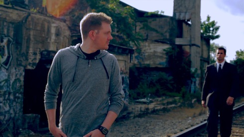
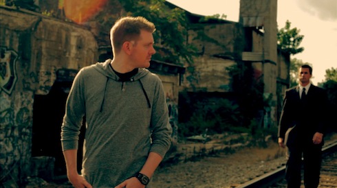
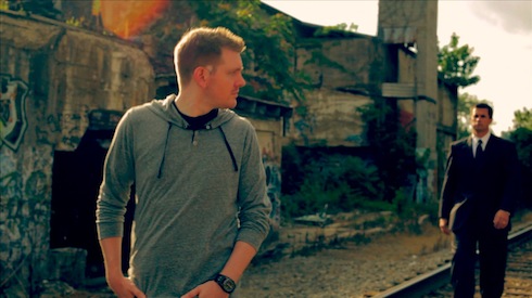
I was recently asked by a friend to figure out the formula for the stylized vintage color grade seen in this music video:
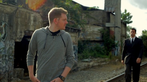
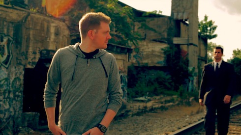
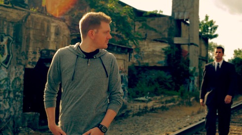
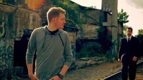
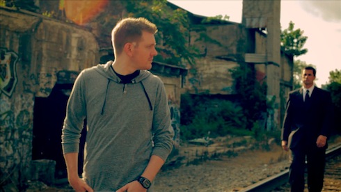
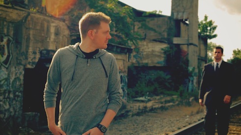
Looking at the video to break the grade down, it’s a very aggressive teal-and-orange look with varying intensities throughout, but it also has a vintage look with not-so-white whites and lifted, milky blacks. He needed the look created in Apple Color, but I thought it’d be a fun exercise to create the look in Adobe SpeedGrade for this post. Here’s the shot we’ll start with:
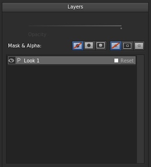
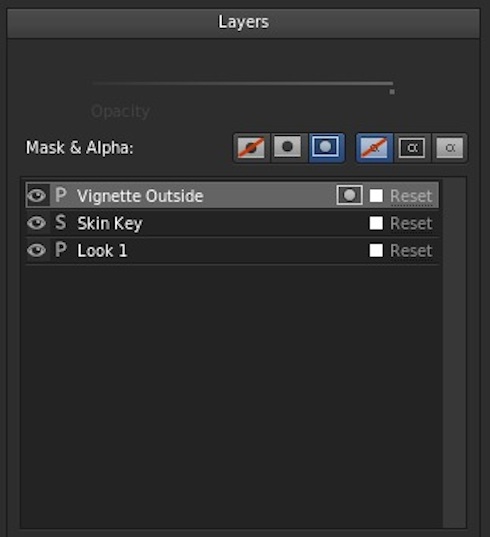
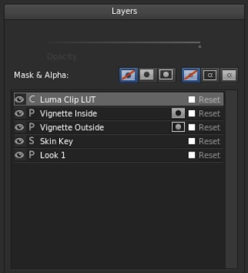
I did all of this on an adjustment layer above the shot (which is a great feature of SpeedGrade). For more info on grading with adjustment layers see my previous post: Color Grading in Layers in Adobe Premiere Pro, After Effects or SpeedGrade. I called the first primary “Look”:
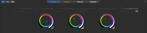
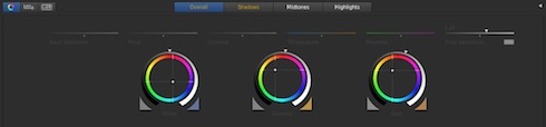
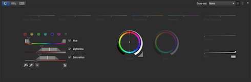
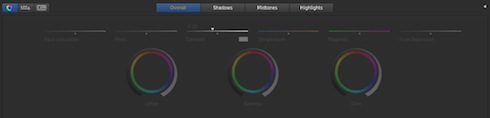
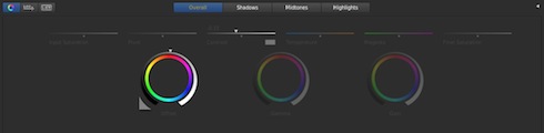
The very first step in creating the look is going to be getting those warm midtones, so we’ll push the overall gamma towards yellow/orange:
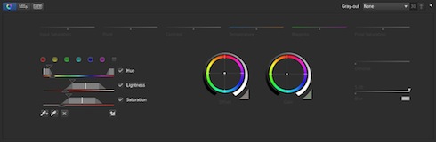
Next we’ll pull the shadows back to the teal/cobalt color. We’ll have to do this using the offset control, which we’ll push teal/blue:
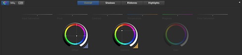
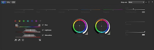
The offset shifts the while image in that direction, so we’ll push some warm tones back into the gain to get where we need to go:
Now you can see the reason we pushed blue instead of green into the offset for the shadows. When we add the bluish offset with the yellow/orange midtones and highlights, the shadows take on that greenish/teal color we want to emulate. It’s one of the things to consider when dealing with an offset/gamma/gain control instead of a shadow/midtone/highlight setup. You can real more about the different types of 3-way color correctors in this great post by colorist Alexis Van Hurkman.
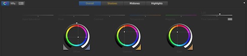
The next step in emulating the look is to start tweaking the shadows. At the moment, they’re way too saturated. We’ll jump over to the Shadows tab and lower the final shadows saturation:
Now we’ll raise the shadow offset a bit since lowering the shadow saturation darkened that tonal range a bit:
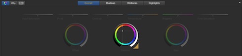
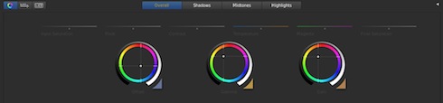
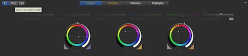
Now we start to make the look more aggressive. We’ll switch to the Overall tab and raise the overall saturation to get those really rich colors in the example:

Now this really screws up the skintones, but we’ll address that in a minute. Before that, we want to make some tonal/contrast adjustments. We want to crunch the shot a bit, so we’ll lower the offset:

Then we’ll raise the gain:
Then we’ll raise the gamma a bit:
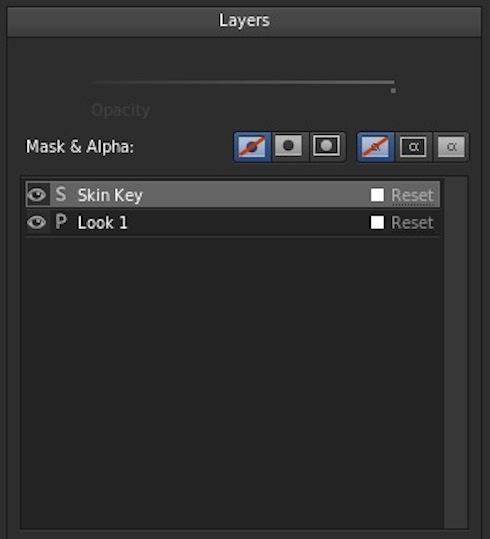
Now we’ll move on to correcting those skintones. Add a new secondary layer (I called it Skin Key):
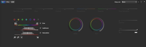
First we’ll pull a key on the skintones. Your qualifier settings will vary based on your footage, but here’s what mine ended up being:
First we’ll push the offset a little bit towards yellow and away from red:

Then we’ll do the same in the gain:

The goal isn’t to make his skin normal. The goal is to make his skin yellow/orange instead of red. After that, an adjustment to saturation finishes the adjustment:
Now we’re going to work on the vignette aspect of the look. Add a new layer, and make sure you switch the vignette/mask setting to outside, since that’s what we’ll be doing first (note the circle-in-rectangle button options at the top):
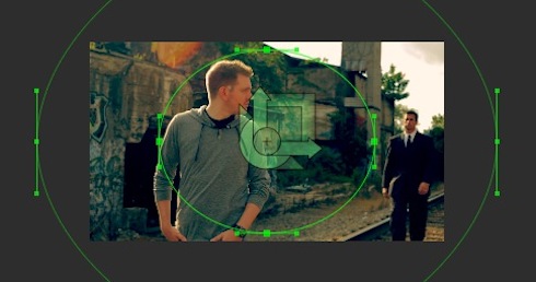
Here is the window shape I used for this vignette:
Now we’ll just lower the offset a bit to darken the edges:
Now we’re going to affect the inside of the window, so make a new layer and switch it to inside the mask (using the circle-in-rectangle looking buttons):
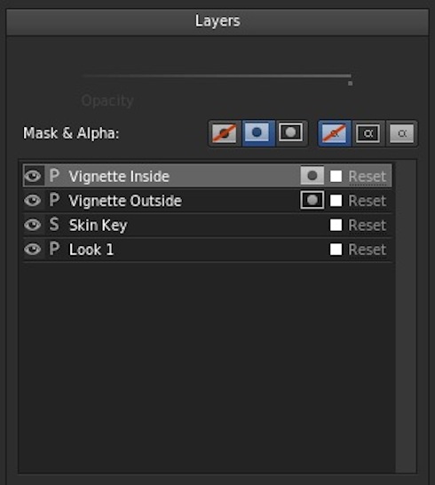
We want the middle of the shot to be a bit more milky, so lower the contrast using the slider:
Then we’ll raise the offset to make it even lighter in comparison to the edge vignette we created:
The last step is to create the clipped whites and blacks, but that’s not really an easy thing to do in SpeedGrade. The only way I found to do it was to create a LUT in After Effects using Color Finesse where I clipped the curves at the top and bottom. To save you time, download that LUT here.
Once you have the LUT file, create a new LUT layer in SpeedGrade:
The LUT layer is a special layer you can get to with the + button to the right of the new secondary button. Once you’ve gotten the layer, select the LUT:
![]()
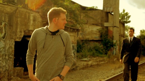
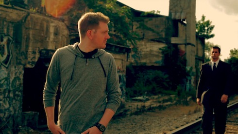
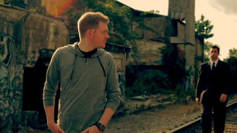
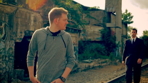
Doing that gives you the final look!
It’s worth noting that this is a very aggressive look that is heavily dependent on you footage, production design, etc. and may need to be dialed back in darker shots. If you’d like to download the free SpeedGrade preset for this look, you can get it here.