Dissecting the Hipster Look

Take an ironic look at ‘hipster’ style color grades.
With Instagram being over 4 years old I think it’s safe to say hipster style photography and filmmaking is more than just a fad. Although a ‘hipster look’ can add some style to your videos, many filmmakers don’t think through their color grading process any deeper than simply adding a preset. In the following post we’ll take a deeper look at the characteristics of a Instagram/hipster color grade, how it mimics the look of some analog film, and demonstrate a potential workflow for achieving this look.
What is the Hipster look
Instead of simply telling you what makes up the hipster look i’d rather show you. In the following examples we will break down the color grade for each image and try to find similarities between them. All of these examples are what I would call “good” hipster grades, but like most artistic things, it is subjective. Examine these images yourself. If you see anything that I missed please share in the comments below. So let’s get started:
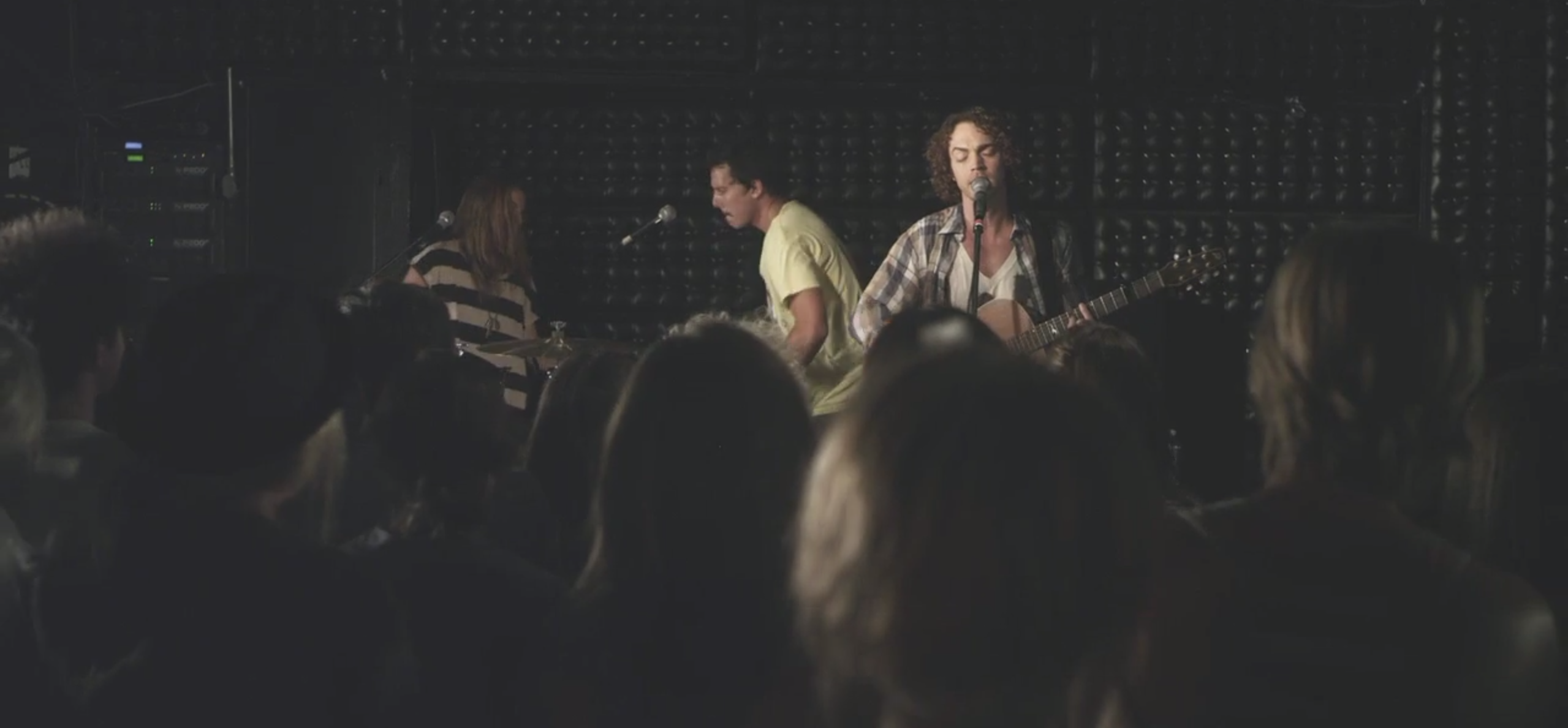
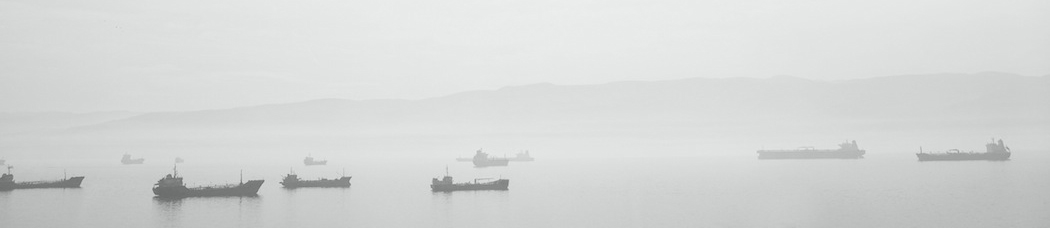
Hipster Hike
Hipster Hike is a video created by Caleb & Sawn on their Vimeo channel. The video is a really great example of a good hipster color grade. The following image is a still taken from ‘Hipster Hike’.
Let’s breakdown this image:
1. There is little detail/information in the black areas of the image
2. The white areas aren’t white but a greyish/yellow.
3. There is more blue in the dark to mid-tone areas.
4. None of the colors are very vibrant
5. Both edges of the frame are dark
6. There is noise in the image
7. It is an altogether soft image no sharp edges.
I Am Not A Hipster
This is a still from the movie trailer “I am Not a Hipster”. A great movie that ironically uses a hipster grade. Classic hipsters…
Let’s breakdown this image:
1. Blacks aren’t completely black they are actually a dark grey.
2. Whites are yellow/grey
3. There are no vibrant colors
4. Nothing is incredibly sharp
5. Even though most of the frame is dark there isn’t a lot of detail in the dark part of the image
Unsplash Image by Dustin Scarpitti
This image created by Dustin Scarpitti of VSCO is a great example of a hipster color grade in modern photography. Unsplash is also a great place to get free stock images.

Let’s breakdown this image:
1. There’s a vignette around the image
2. The whitest parts of the image are yellow/orange
3. The blacks aren’t all the way black
4. The image is altogether soft
5. The image isn’t very vibrant
Common Themes
Now that we’ve looked at a few examples lets talk a little about some of the similarities.
1. Vignetting
Most if not all hipster color grades photographs feature vignetting in some form or fashion. Sometimes vignetting is created simply from the layout of elements in your scene and sometimes it needs to be added in post.

2. Crushed Blacks
Most hipster style images feature more detail information in the midtones and highlights and less in the black parts of the image. This is known as crushing the blacks.

3. White is Grey
Hipster photography typically maps the white parts of the image to be more grey. This often results in hipster grades making the image darker than it originally was.

4. Blacks are Dark Grey
After the blacks have been crushed they are usually lifted to become dark grey instead. This makes the entire image look more ‘milky’.

5. Blues in the Darks, Yellows in the Lights
Most hipster grades feature more blues in the darker parts of the image and more yellows in the lighter parts of the image. Keep in mind that these are usually subtle tweaks that complement the image, not take away.

6. Desaturation
Most hipster photography and filmography doesn’t have vibrant colors. This is probably because hipster grades try to emulate film which is simply not as vibrant as digital cameras, especially if it has time to decompose. The most vibrant parts of hipster images tends to be in the yellows and the magentas.

7. The Image is Soft
As you probably already know digital cameras tend to be much more sharp when compared to film cameras. Sharp video isn’t common in most hipster color grades as it makes your image look too mechanical. You can fix this by adding small blurs and noise to your images.
Hipster Grading in Action
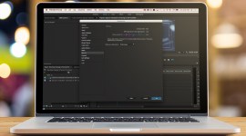
So now that we’ve broken down what makes up a hipster grade lets take some of the things we learned and apply them to an actual photograph in After Effects.
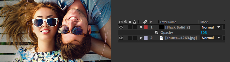
1. Create a Vignette
The first step is to add a vignette to the image. In this particular case it seems like there is a lot of brightness in the left area of the frame and a little too much attention being drawn to the guys arm. To fix this problem we will create a new black solid and drop the opacity down to 30% so we can see our image underneath. I typically like creating my vignettes using the pen tool. I also don’t like simply making making my vignettes a ellipse. Once you make your vignette you’ll have to feather it out until you get a well balanced image.
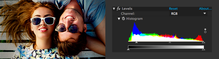
2. Crush the Blacks
Create a new adjustment layer and add a levels effect. After Adding the levels. Now grab the left arrow and drag it to the right until the dark parts of your image are crushed. Also, make sure your adjustment layer is positioned over your vignette.
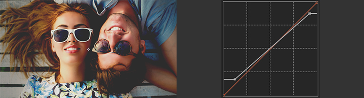
3. Adjust the White Point
Now add a curves effect to your image. Let’s bring down the white points so that they are light grey instead of white. You can do this by simply drawing the top right corner of the RGB curves bar down and to the left.
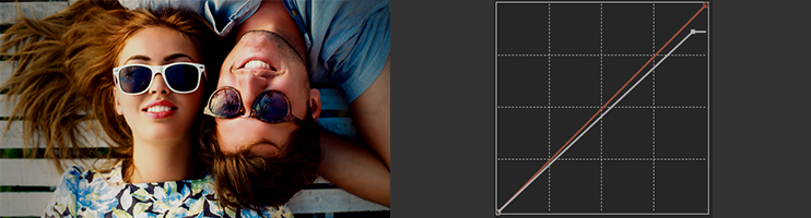
4. Adjust the Black Point
Now let’s do the opposite for the black parts of the image. Grab the bottom left point in your curves effect and drag it up and to the right. This will make your black points a shade of grey rather than simply black.
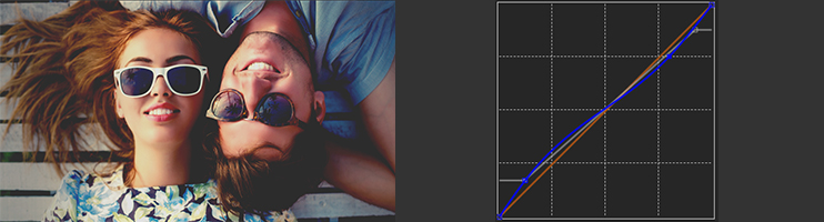
5. Adjust the Blue Curve
You can add yellows to the highlights and blues to the darks by adding an “S” curve to the blue channel. To do this simply click the dropdown box that says RGB and select blue. Now you can adjust the curves to create a backwards “S” shape in the image.
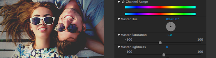
6. Desaturate
Next add in the “Hue/Saturation” effect to the adjustment layer. Bring down the saturation point just a little. I find that a number around -10 works nicely.
7. Soften
Most digital images tend to be sharp and mechanical to fix this we need to soften up the image. Simply adding a gaussian blur and setting the blurriness to “1” will work just fine.

There you go! Using just a few simply observations we can create a hipster style image in no-time. Try playing around with these different effects to get different results. Adding things like grain and light leaks can give your images a hipster look as well. You can find a few grains for free in our ’10 Free Film Grains for Video Editors’ post.

This is of course just one example of how photographers and filmmakers give their images a hipster style. If you want to learn more about doing hipster style color grades check out the following resources:
Hipster Color Grading – ISeeHue
Luster Grade Presets – CineBlur
Amazing MBL Color Grading – MBL
Have any other tips for creating a hipster look? Share in the comments below.