The Video Editor’s Guide to Color Grading

Increasingly, color grading is being handled by video editors working on laptops and desktops instead of calibrated displays. Here are some ways to make this reality work for you.
Professional color grading applications have plummeted in price from six figures to zero. Meanwhile, accurate, grade-quality monitors have continued to remain expensive and out of reach. This bifurcation of technology has created a whole generation of people doing color work on video without the ability to evaluate the results on a properly calibrated display.
First off, a caveat: it is a much better experience to color grade in an environment suited for accuracy with a color-calibrated display. The problem with color is that it is so hard to do right, and so easy to really screw up.
If your pipeline includes finishing in a color suite with a skilled colorist, then stop reading now. If, however, you are part of the vast majority of people doing color work for video who are precisely NOT colorists, then this article will have some helpful tips to get you through to the finish line.
Increasingly, color correction and grading is being handled by editors on portables and desktops, creating content that will live on mobile phones and in someone’s Facebook feed. For most content, color doesn’t need to be perfect — it just has to be in the ballpark.
You’re Not a Colorist. So What?

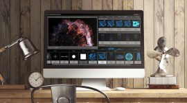
Image via Blackmagic Design
You are not a trained colorist, yet your post-production pipeline requires you to play that role. This is especially true on the corporate, indie, and industrial end and for material that will live in the social media ecosystem. It’s not wrong, it’s just projects with deadlines and low budgets — how media is created now.
For decades, shows were shot and edited with post-color handled as an afterthought — if it was ever thought about at all. In the early 1990s, I used a Time Base Corrector (TBC) to make sure color values were “kinda right” and that was the extent of it.
It was up to the DP and camera crew to make sure the light sources were a consistent color temperature, and the camera was properly black and white balanced. Everything came to me as Rec 709 on a tape, and there wasn’t a lot I could do beyond the most basic of signal adjustments.
Nowadays, editors have to deal with terabytes of log encoded or RAW video streams, where the options for screwing up color are literally endless. This is fine on the high-end of the production ecosystem, since there was a DIT on set and a colorist in post to handle all of it. What’s disturbing to me is how much I am seeing this workflow on the lower-budget end, where it seems that the decision was made to set the Sony to S-Log and that was that.
Like I said, you’re not a colorist, but everyone in the pipeline before you decided you would be. Blame it on the culture of delayed ambivalence that permeates a technology-saturated industry. Whatever it is, you have a bunch of clips and you need to make sure that the people don’t look purple and the budget didn’t include a grade accurate monitor.
NLE or Dedicated Grading App?
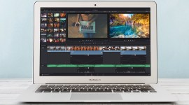
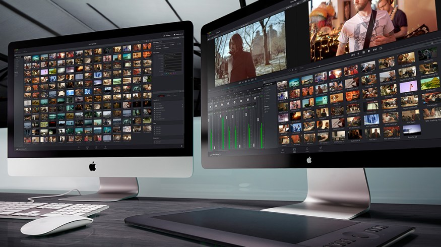
 Image via Blackmagic Design
The first choice you have to make is which kind of application you’re going to use. Color grading can be done in either your NLE (like Premiere and FCPX) or in a dedicated color grading application like DaVinci Resolve (which is also a program you can do all your editing in, by the way).
While there are fantastic tools inside Resolve, and it’s a free download, chances are you’re coming from the editorial side of the post house and it’s going to be easier for you to just work with a program you’re familiar with. So stick with coloring in the NLE for now. I will limit this survival guide of sorts to working in NLEs with some plug-ins.
Don’t Switch Monitors or Rooms
This may seem simple and kind of dumb, but post workers are constantly hopping from machine to machine based on traffic and need in a small post house. It may be tempting to do a quick color pass on the iMac in the office and then just finish it up on your MacBook Air at home.
While you don’t have the resources to be working with an accurate display, don’t add in the variable of working with multiple inaccurate displays in to your pipeline. The relative differences between your iMac and MacBook Air’s monitors is enough to send you spinning in iterative circles for hours.
Same goes for your environment. Dedicated color grading suites and theaters are blacked out rooms that starve poor colorists of much needed Vitamin D. I know colorists so starved for natural light that they resemble Gollum from Lord of the Rings — a necessary sacrifice to their craft.
Everyone else in post has a window, fresh air, and sunshine. You don’t need to draw the shades, or paint the walls in soul-sucking gray tones, just do your color work in the same place. Your eyes and brain make constant adjustments to your perception of color and brightness when changing lighting conditions, don’t add this to the mix.
Scopes and Tools
Now, let’s take a look at how to make color adjustments to your image based on what you’re seeing in the tools and scopes that already exist in your NLE. The trick is knowing what you’re looking at, making a change in the right direction, and gauging feedback based on what’s changed in your scopes and tools. Every single NLE, color grading app, and plug-in suite contains a multitude of tools to help you make sure color is spot-on.
Think of these things as the instruments on the control panel in a cockpit of a plane, and the windshield is a grade accurate monitor. A pilot is going to use both to not crash the 737, but, if she had to, she could land everyone safely with the instruments alone. I don’t really know anything about flying planes, but it seems like a useful analogy. You are the pilot landing in pea-soup thick fog. Thankfully that’s really just a metaphor. It’s just desktop color grading. You’re going to be fine.
So, now that we’ve talked about all the reasons why you can (and probably have to) color grade your projects without a calibrated display, here are some specifics on landing your plane with instruments only.
What Kind of Footage?
You are most likely going to be handling clips that were shot one of three ways: RAW, log-encoded, or “video” with or without a profile. All of these are strategies by the camera and camera crew to preserve as much color and latitude detail as possible to the image.
The short history of video cameras and formats is a history in throwing away image quality and detail in order to reduce data rate. Video was the inexpensive way to capture an image but it did so by crushing shadow detail, blowing out highlights, and ignoring most of the color it was seeing. Video professionals of a certain vintage are traumatized by blown highlights and noisy shadows. Shooting in log, RAW, or creating a flat profile allows for the capturing of details that would otherwise be lost if the camera was set to a standard Rec 709 profile, particularly highlight and shadow detail.
Start With a LUT
If you are starting with RAW or log-encoded videos, then the first step you need to take is applying a tool called a Look Up Table or LUT. This is the one of the easiest steps in the process, but also the easiest thing to screw up.
There’s no magic to a LUT, it’s just a way to take that massive amount of image data (color, gamma, black point, etc.) in your source footage and reduce it to just the parts you need. A LUT moves an image from one color space (like S-Log) to another color space (like Rec 709).
 Premiere Pro CC has a nice set of pre-installed LUTs in the Lumetri Panel that you can use to easily drop on to your footage.
This process changes the way the image appears, without changing the image itself. You, the lonely post worker, see the dull washed out image automagically transformed into an image that looks kinda like how it’s supposed to look. All that washed-out stuff is still there, it’s actually valuable information that you can use to tweak the output if you need to do that.
 The above image is out of camera. The below image has a LUT applied. Images via Kontent Films.
There are times where everyone on the production side did their job correctly and all you have to do is drop the “Log to Rec 709” LUT on top of the clip and, voila — instagrade. You end up looking like a genius when all you’ve done is the thing that cameras had done for years but suddenly stopped doing as of late. As I said, this phenomena will happen to you once in a while, so, you know, don’t count on the LUT doing all the work.
Start With a Profile
Flat profile video is just video with a flat gamma curve applied rather than the standard Rec 709 gamma. If production shot with a 5D or similar DSLR, this is the flavor your video will most likely come in.
This is done in camera to try and capture detail that would otherwise be lost with Rec 709 gamma curve — it’s a strategy to squeeze out an extra stop or two. It’s going to be your job to massage whatever detail was captured into a clean, bright looking image. You will need to apply a profile to get that dull-looking frame looking like a snappy image.
Auto Color: Go Ahead! Use It!
Auto Color or Auto Balance functions in color correction tools can be a total time saver. When they work well, they do a great job.
Magic Bullet Colorista III has an exceptionally good Auto Color tool. I use it all the time. And of course, there is immediate UI feedback. Color correction is an additive process, meaning to get correct balance, color values are added to existing channels. If the shot is too blue in the whites, then yellow is added in the highlights control. Even if the Auto Color function doesn’t get you exactly where you need to be, it can be a very useful tool to point you in the right direction.
 Above is the UI for Colorista III. I’m going to grab the Auto Balance eye dropper and click on something white in the image below.

I clicked on the hood of white car, framed between the man and the woman. Note that in the above Highlight color wheel on the right, the control dot has jumped into the yellow. Auto Balance looked at the color values in the hood of the car and determined that the image needed to be warmed up in highlights. It’s close, but it’s not right. This is where you need to look at scopes and think about the image you are correcting.
The RGB Parade
My favorite scope is the RGB parade. It’s a type of waveform monitor (there are many). You can learn so many things about your shot just by looking at it with this tool. Quite simply, it displays the Red, Green and Blue values of your image as individual waveforms, side by side, in “channels.” If you have an image that’s got a lot of red, then you’ll see a really busy looking red waveform and not so much in green and blue.
You could probably tell that just by looking at the image, of course, but it becomes far more useful when you have an image with crushed or blown out parts of the shot and you need to determine which channel is blown out, and consequently, where you need to fix the color. However, with everyone shooting in log or with profiles, most likely your native footage is going to have a very conservative, quiet looking set of waveforms.
Below, we have three waveforms displaying the color channels of our above source footage that was shot S-Log on a Sony FS7. Nothing brighter than the low 60s, and nothing darker than 9 or 10. The blue channel is lifted more than the other two, so it’s a cool image.
 Watch what happens when we drop a basic Log to Rec 709 LUT on top of the shot.

It really lifts the blue channel, and consequently, the image cools down even more. Why is that? This is where you need to get some information, either by analyzing the shot, or emailing the folks in production.
Take a look at the shot, what time of day was it recorded? What’s happening in the frame? There are lights in the background, but not all the buildings are lit up. So this is either the beginning of the day or the end. Either way, you have a dawn or dusk shot with no direct sunlight visible.
This is a cool (meaning bluer) image than something shot during the middle of the day, or even at sunset or sunrise. An email to production confirms that it was indeed shot just after sundown. So it should appear cool in the highlights. However, Auto Balance doesn’t know that, it just “sees” something you said was white and corrected accordingly.
 See how nice and even those waveforms are? When the tops all line up like that, then you’ll have a color-balanced image, but it won’t be “correct” for the shot. An audience won’t have the visual cue of “cool evening right after sundown” that is needed to place the shot in the story.

 However, I thought the image looked “too blue”, and just walked the highlight selection tool back down the vector that Auto Balance found. I “split the difference” between the Auto Balanced image and the role color is playing to tell the story in the shot.
Other questions you have to ask about the shot, “What was the air like? clear? smoggy? cloudy?” This will help you determine where to set your black point (the darkest pixels in the image) and the white point (brightest pixels in the image).
A full, bright day will have highlight values in those RGB parades approaching 100, while the deep shadows will be kissing 0. Foggy, or in the case of this image, smoggy, will lower the highs and bring up the lows. Next up: skin tones.
Skin Tones
 Same skin color, different skin tones via Shutterstock
As far as coloring without a grading display, this might be the most complicated part, because it’s all about making sure people are the right color.
Colorists spend a fair amount of time thinking about skin tone. They have to. Audiences never notice when skin tones are correct, but they wince when they’re wrong. All human skin is the same “color,” occupying a narrow band of a specific hue vector on a vector scope. This is called the “FTL” or Flesh Tone Line. It is the tonal differences that are most notable, and most often misidentified, as different skin “colors.”
Skin Color is All the Same Color
Human beings vary ever so slightly in terms of actual color (hue), since every person’s skin is made up of the same stuff: the pigment melanin, blood, and blood vessels.
This is also the reason why getting skin color is so important in a color grade — we are experts at knowing when skin color is incorrect, even if we don’t know why. Call it the uncanny valley for human flesh tone. Colorists make sure that people look like people, and also that those people stand out from the background and other non-people things in the frame.
The Vectorscope
 Lumetri YUV Vectorscope in Premiere Pro CC
When it comes to determining skin tone, nothing is as helpful as the vectorscope. It can honestly appear kind of mystifying at first. Think of it as a tool that maps the color information in your image to the color wheel you see at the beginning of all color theory and art “how-to” books. It has little target areas that match up quite nicely with the hue and tonal ranges you see on color bars. (Side note: color bars have become less and less de rigueur these days, but color bars and chip charts can be your best friend when it comes to figuring out where to push color.)
There is also a very useful little line that cuts diagonally through the top left of the vectorscope, between the Yl (Yellow) and R (Red) targets on the Graticule. This is called the “Flesh Tone Line” or FTL.

Since all people are the same skin color, and only our skin tone varies, then everyone in your frame will line up along this line. The lighter tones towards the center, the darker tones towards the outer edge.
Fill the Screen With Skin
What would be a really handy tool would be to isolate and display a certain subjects skin tone only in the vectorscope. There are some hacks and tools to do this in Resolve. Other dedicated grading systems, like Nucoda Film Master, do this very easily — but not so much in your NLE. The easiest thing to do is just scale your image until the target skin tone fills the frame and you are literally looking at just that — only skin.
 Top image of the two hands scaled up to 1300 percent and repositioned to fill the canvas with one of the target skin tones.
You’ll quickly see all other extraneous information fall away from the vectorscope and see exactly where skin hue and tone values are landing in your vectorscope.
 Scaled the image by 1300, then repositioned the image so the skin tone on the left of the frame filled the canvas.
If I reposition the image on the canvas so that the lighter skin tone fills it up, look what happens.

The color falls right on the FTL just closer to the center of the graticule. Same color, lighter tone, closer to the center of the graticule.
Cosmo and Skin Overlay Tool
Red Giant Software’s Cosmo is a tool designed for skin color correction and “softening” (aka wrinkle removing). It does the kinds of things you’re already doing in your native color correction tools and plugins, just in an automagic kind of way.
 RedGiant Software’s Cosmo Skin Color Tool.
 The Show Skin Overlay grid. Note that the woman’s red hair shows up in the skin tone range.
I use it quite a bit, particularly because it has a really handy analytic tool called “Show Skin Overlay” that shows the parts of your image, via an orange grid, that are the color of human skin. Which may not always be human skin, and human skin isn’t always skin color (more on that below).
Exceptions
Sometimes skin color is not the color of skin, and building keys and mattes to isolate skin tones to “correct” it is the absolute wrong thing to do. For example, take a look at the shot below. In context, your audience understands that this couple is walking down a sidewalk and they’re lit by colored neon lights and yellowish-red street lamps.


Their skin tones don’t line up on the FTL, and they shouldn’t. You could correct the image so that they do, but then you’d be wrong. Whether your audience knows the reason why or not, the effect is the same. In these cases, your job as a colorist is to make sure skin color is correct for the shot and scene. In this case, it needs to look like the people are lit by a red neon sign.
Conclusion
There are times when color management and monitoring tools will fall short of what your eyes are seeing. Particularly in shot-to-shot matching, when the subjective experience of color differences contradicts the objective measurement of color values.
You, the valiant-yet-under-resourced post-professional, will be flying blind, so to speak, without a properly graded monitor. Use these tools to get you close, and then review the work on many screens: phones, tablets, TVs. Get a sense of what your color will look like in a multitude of different viewing environments. Color is a science and an art. Without the aid of a properly graded monitor, you’re going to have get really good at making educated guesses about where things are lining up. It’s not ideal, but it is doable, like many things in post-production.
Got any tips for video editors that find themselves doing color? Share your insight in the comments below!