Color Grading Inspiration: Movie Barcodes and Color Palettes

These color charts break down popular movie scenes and a film’s overall color composition. Find inspiration for you color grading projects.
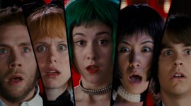
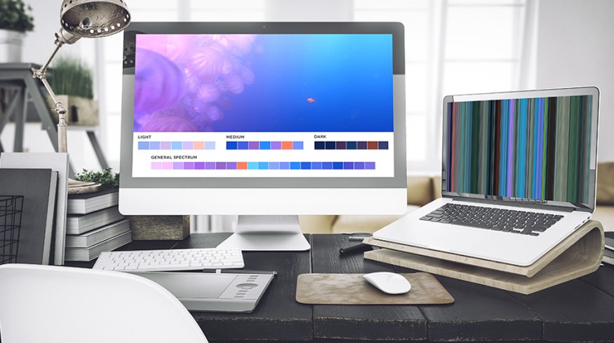
Top image via Shutterstock
Whenever tackling a color grading project, colorists and video editors often attempt to emulate the look of another film. There are plenty of great places to find color breakdowns, but two of my favorites are Movies in Color and Movie Barcode. As far as breakdowns go, these are untraditional. You won’t see talk about exposure, contrast, or really any technical talk. Essentially you are breaking down the most popular colors used in one scene or looking at the entire film at once.
Movies in Color

Image via Movies in Color
Movies in Color was started by Roxy Radulescu, a graphic designer who grew tired of looking through Pantone books and experimenting with the color wheel in Photoshop. While watching Skyfall, the cinematography of Roger Deakins really grabbed her attention. It was then she decided to find still images from the films, and breakdown the colors used in a scene.
Eventually, I used the blog to keep a record of color palettes that I could use in projects, or that I could reference for a few interesting color combinations. I was very excited to find other artists also found them useful for their projects. So far, it has not only been an aesthetic pursuit but also an educational one. Overall, it is a study of color in films, but mainly, it has other uses and applications. One of the goals is to give artists and designers color palettes they can use in paintings, films, videos, graphic design, and other pursuits. – Roxy Radulescu
Though the updates only come a few at a time now, the Movies in Color archive is a great source of inspiration. For more about her process, check out this great writeup she did for Shutterstock. Here are a few popular examples (via Movies in Color).
Director Tim Burton and cinematographer Thomas E. Ackerman’s dark-yet-colorful Beetlejuice.

Christopher Nolan and Wally Pfister’s take on the Joker’s demented personality in The Dark Knight. (Note how muted the greens are.)

The bright 70s style of Richard Linklater and Lee Daniel in Dazed and Confused.

Ivan Reitman and László Kovács dry (to match the humor) tones in Ghostbusters.

Movie Barcode
While some films standout on their own for their superb color work, inspiration can also be found by analyzing the entire film at once. Sites like Movie Barcode take an entire film and condense it down into a literal barcode of color. The most powerful colors from each scene stand out, showing you how the film’s color progresses and coincides with changes in plot. (Images via Movie Barcode.)
The sci-fi futuristic colors of Blade Runner.

From colorless Kansas, down the Yellow Brick Road to the Emerald City in The Wizard of Oz

The dreary haze of Harry Potter and the Deathly Hallows: Part II.

The stunningly vibrant colors of each fight in Hero.

The overly saturated and beautiful world of Amélie.

The repetitive story yet different outcomes of Run Lola Run.

The colorful desert city of Agrabah in the animated film Aladdin.

For more Movie Barcodes, be sure to check out their Tumblr page. For multiple color schemes, check these color combinations at Shutterstock.
What are some of your favorite places for find color grading inspiration? Let us know in the comments below.