Everything You Should Know About Picking Your Film’s Color Schemes

A purposeful color scheme is a vital core component of a film’s cinematography. Let’s explore how color sets a film’s tone, emotion, and complexity.
When starting out on your short or feature film project (or, really, any type of film or video project), there are obviously many early decisions to be made. You’re thinking about your story. You’re thinking about your script. The budget, locations, and actors.
You start working on your storyboards, planning your shot lists, and begin an overall discussion of your compositional strategies. Another facet of your production that needs to be considered before the first frame is shot — your project’s color scheme, one of the core components of your film’s cinematography.
When you think back to some of your favorite films, you’ll likely notice that color plays a huge part in your cinematic memories. Color helps to tell a story. It defines characters and emotions and creates beautiful, lasting images.
If you haven’t yet thought about the color scheme of your next project, now’s the time. Let’s dive into what needs to be top of mind when choosing your film’s palette.
Why Is Color in Film Important?
Before we even dive into color theory, let’s go back to the basics. What is color in film? Where does it come from, what does it do, and why is it so important?
As you can see in the video above, color is basically the foundation for how we communicate in the language of film. It influences decisions made by almost everyone involved in a production — from the director and cinematographer on down — as they develop motifs, themes, and characters. These decisions dictate how colors — and variations in hue, saturation, and brightness — work together in symmetry or in contrast to develop the looks that bring a film’s narrative cinematography to life.
Here’s a great article that dives deeper into the basic properties of color. It offers some pretty cool insight into how these core color principles have been used in high-cinematography films like Blade Runner 2049.
Understanding Color Theory

The colors you choose for any given scene reflect the emotion you’re trying to convey. From left to right, Images via A24, Bleecker Street Media, Fox Searchlight Pictures, Paramount Classics, Warner Bros., Warner Bros., Fox Searchlight Pictures.
First and foremost, in order to best develop your film’s color scheme, you’ll need a thorough understanding of color theory. Fortunately, color theory is actually quite fascinating, as it explains how humans perceive emotions in all manner of art and nature. You can read a great deal more on color theory in this comprehensive article, but here are some accepted basic emotional properties for different colors often found in cinema.
- Red: Aggression, violence, and anger.
- Orange: A sense of warning and caution.
- Yellow: A sense of danger, judgement, and assertiveness.
- Green: New life, new beginnings, and survival.
- Blue: Faithfulness, loyalty, and childlike wonder.
- Purple: A sense of ambiguity and extravagance.
- Pink: Associated with romance, love, and passion.
Those are, of course, just a few examples. Color theory is very much open to both interpretation and intentional divergence, which explains how filmmakers are able to create complex emotions by using, changing, and challenging the above.
The Importance of a Color Palette

Create your own color schemes by researching your favorite film’s color palettes and barcodes. Image from Skyfall via Movies in Color.
Along with a grasp of color theory, another important tool to use when deciding your film’s color schemes are your film’s color palettes and barcodes. These are snapshot looks that offer greater insight into a film’s overall use of color. You frequently see these online, and they’re a very cool way way to see the unique — and often surprisingly focused — color schemes of your favorite films. Here’s a great article that dives further into how to study, analyze, and create color palettes and barcodes of your own.
Choosing Your Color Schemes

Determining the theme, conflict, and message of your story will aid in deciding on a color scheme. Image via Leonid S. Shtandel.
Once you understand how color theory will impact every aspect of your film — and the story at the heart of your film — it’s time to choose and develop your color schemes. Here are some helpful questions to ask yourself as you begin making your color decisions.
- Who are my main characters and what characteristics define them?
- What’s the essential conflict of my story?
- What are the themes of my story?
- What message (if any) would I like to get across?
There are no right or wrong answers here, and your ideas might change as production advances. Nonetheless, using the above theories and techniques to form an early idea of the colors, themes, and characteristics you’d like to develop is a great way to start. Now, we’ll dive into how to begin bringing your color schemes to life in your projects.
Using Color in Your Compositions
When filming begins, you’ll find many tools and techniques that can help you create and manipulate color in your on-set compositions. For instance, working in camera with color temperature and monitor calibration, while also exploring your vast lighting and gel options. Additionally, things will go smoother if you understand the basics of camera color science and the value of on-set tools like color charts.
All of the above considerations (and more) are covered in the posts below. Taking even half of the tips in these articles to heart will seriously improve the way you work with color.
- Production Tip: How to Calibrate Your Monitors on Set
- Understanding Set Lighting and Color Temperature
- 6 Creative Ways to Enhance Your Next Film with Gels
- Production Tips: Working With a Color Checker on Your Next Shoot
- Understanding Color Rendering Index with LEDs
Adding Color in Post-Production Grading
And finally, while you’re very likely to find a ton of great (and sometimes not so great) pieces of advice on how to create, add, or change your film’s colors in post-production, color grading should really only be thought of as a way to touch up the color schemes you’ve been developing since pre-production. The power and all-around awesomeness of color editing platforms like DaVinci Resolve doesn’t make them a cure-all for poor planning.
That said, with proper preparation, enhancing the style and effectiveness of your colors in post is a great way to apply the finishing touches to your well-orchestrated color scheme. Here are some helpful tutorials and free assets to get you started.
- The Best Color Grading Software and Plugins for Video Editors
- 52 Free Color Grading Presets and Looks
- The Video Editor’s Guide to Color Grading
- 29 Free LUTs for Video
- How to Alter the Color of Your Video Using Lumetri Curves
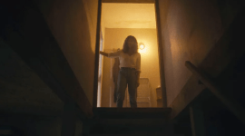
Cover image from Blade Runner 2049 (via Warner Bros.)