From “The Wizard of Oz” to “Transformers”: 100 Years of Color Grading

Since the early 20th Century, color has been an integral part of cinema. Here’s how to recreate some of the most iconic trends in DaVinci Resolve.
Color grading has evolved through several periods throughout cinematic history. In this tutorial, let’s take a look at a few of the most prominent — and how you can re-create these looks yourself in DaVinci Resolve.
Technicolor

The Wizard of Oz (MGM).
Made famous by The Wizard of Oz, Technicolor was a three-strip process that involved huge cameras and even bigger projectors. Because of its quirks, it delivered posterized primary colors. You can recreate this with modern color grading by using splitter nodes and dividing your image into red, green, and blue — and then recombining.
Sepia

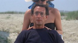
The Godfather (Paramount).
Shot by the “Prince of Darkness” Gordon Willis, with deep blacks and bloomed, creamy whites, The Godfather was made in the ’70s but aimed to recreate the ’40s. It did this by adding a warm, nostalgic tint to the highlights and desaturating its other colors. You can get this effect by using Resolve to add a gradient map that will tint the highlights, while leaving the blacks neutral.
Bleach Bypass

Saving Private Ryan (DreamWorks).
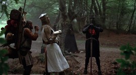
Bleach Bypass is a technique first used in the 1958 Japanese film The Ricksaw Man. It involves skipping over the bleach step in the film’s chemical processing. This leaves a lot of the silver in the film stock, giving it an extra contrasty, desaturated look. The best result used to be in the actual exposed camera negative. However, the insurance companies hate this because if the result was too extreme, and you had no way of going back, you would have to reshoot the scenes.

1984 (20th Century Fox).
It was used in a lot of early films that tried to distance themselves from the hyper-saturated, sunny look of Technicolor. But it wasn’t brought back into popularity until Roger Deakins used it on the film 1984; however, the most famous use was in Saving Private Ryan. You can get the look by making a mask of the skin range and keeping its color, while desaturating other values.
Teal and Orange

Transformers (DreamWorks).
This trend was happening for a while, since the rise of the digital intermediate, because warm colors seem to advance and cool colors recede, so grading your subjects warm and your backgrounds cool creates an added sense of dimension. It wasn’t until Michael Bay’s first Transformers movie that anyone really pushed it to the limits. Many Hollywood blockbusters followed, which is why it has come to be called the blockbuster look.
To create this look, split the image into skin tone and neutral values, and move the color temperature of both in opposite directions. Skin becomes warmer and pops out, whereas the cool background recedes.
Interested in the tracks we used to make this video?
- “Sunshine Tomorrow” by Magnetize Music
- “Up Vote” by Ben Beiny
- “The Apogee” by Simba Music
- “Standing on the Edge” by Luciano Music Co.
- “One Night in One City” by Crescent Music
Looking for more video tutorials? Check these out.