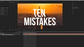
Video Tutorial: 3 Motion Graphics Typography Tips for After Effects

In this After Effects video tutorial, learn how you can produce amazing typography titles using these 3 motion graphics tips.
There are many ways to animate 2D text. It’s simple. You grab the Text Title tool, type out your text, and animate. However, how much thought went into the layout and type choice? In this After Effects tutorial, learn how to neatly place your titles and create contrast within the same font family.
Even when the graphic design portion of the title is complete, you still have the daunting task of animating it. With the endless ways you can animate your titles, we will focus on three incredible techniques to help you get professional results.
Download the project files.
1. Using Masks As Transitions
Sometimes you don’t need to be flashy with your animation. Perhaps you need a clean reveal that is simple and gets to the point. By using masks to reveal your titles, you can quickly get your text on screen. Plus it looks very clean!

2. Using Transform Animation Properties
When you open your text layer in After Effects, there is an “animate” tab that allows you to individually control your transform properties. This is one of the best and quickest ways to animate your title. You can animate your title any way you want.

3. Using Shapes
When you need to spice up your typography, creating shapes helps your title stand out. Shapes can be great for adding extra elements to your scene and for revealing on your titles.
If you’re looking for amazing, ready-to-go typography motion graphics, check out Twenty Twenty at RocketStock.com.
https://vimeo.com/157744446
Graphite is a unique, minimalist typography template for After Effects with thirteen pre-made title sequences. It’s available at RocketStock.com.
https://vimeo.com/149454501
Looking for more video tutorials? Check these out.