Creative Inspiration: Showcasing Color, Contrast & Composition

Check out these great resources to better understand how tweaking your color, contrast and composition can improve your creative work.

Recently there have been a few great links floating around Twitter and elsewhere to some really fantastic articles on color, contrast, composition and how a few simple tips can help improve the final output of your creative work. I’ve tried to pull them together here for your viewing pleasure and creative edification. Enjoy!
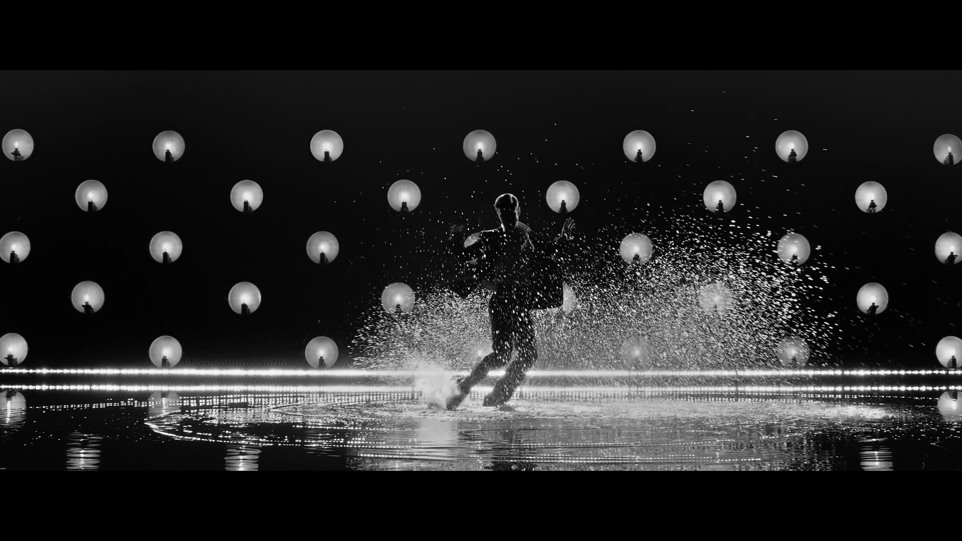
What happens when David Fincher, Matthew Libatique and Justin Timberlake get together…
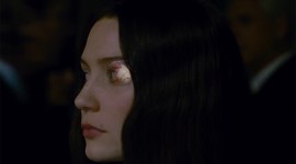
I think this Justin Timberlake music video, directed by David Fincher and shot by DP Matthew Libatique is a pretty stunning example of what great composition, contrast and featured lighting can create. When images are stripped of all their color the eye is far better able to focus on just the shapes and spaces. Geometric shapes are easier to take in and can create great negative spaces. Fincher and Libatique shot on 5 RED EPIC Monochrome cameras at an ASA of 3200 apparently.
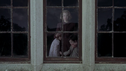
Another stunning resource for analysing more black and white images is Evan Richards’ post filled with film stills from Raider’s of The Lost Ark in black and white. Evan noticed in an interview with director Steven Soderbergh that he had watched Raider’s 3 times in one week and entirely in black and white. Again by simplifying the visual data the eye is receiving its much easier to focus on the nature of the composition and contrast in the images.
Here’s a cool trick, next time you’re framing up try to strip out all of the color on your monitor and then once you’ve got things looking right dial the color back in.

Understanding Contrast and its Various Effects
Editor and colorist Aaron Williams has written up a simple but effective post on how ‘Contrast is king’ and can be used for technical reasons (increasing perceived sharpness and so ‘fixing’ soft-focus shots) as well as creative ones. Aaron supplies some great examples of how tweaking your contrast can dramatically set the tone and feel of your images.
Often, it’s what the audience can’t see that creates tension. Noir films used this to great effect with the ultra-high contrast by creating blacks so deep the audience just knew someone had to be lurking in the shadows.
Tweaking Color Temperature to Create Depth & Dimension
Director of Photography Shane Hurlburt (ASC) recently shared this great post on using color temperature to create depth and dimension when shooting HD video. Shane also has some great examples of how to make the most of the natural color temperatures of different light sources to create realistic looking images (as in true to life, rather than ‘Hollywood-ised’) and how he used this to great effect on Crazy/Beautiful. Fascinating stuff.
While working with one of my favorite directors, Maurice Marable, we were doing a spot in an underground parking garage. When you went with the color temp of the lights that existed in the space, the mood was blah, no depth, no dimension. I got on the scroll wheel of the Alexa and cranked it down to 2700 deg. Kelvin, and Maurice was like “Wow, that looks bangin!!!” Just the simple use of this tool can create a whole other chapter in the way you light.

What films/projects have you seen that have a unique approach to color and contrast? Share project names and links in the comments below!