5 Breakdowns on Replicating the VOX Motion Graphic Look

Let’s explore VOX’s small motion design nuances that keep the content engaging, plus a few ways you can emulate the style.
VOX is easily one of the biggest explainer channels on YouTube. They have explainer videos on just about everything—from videos covering global politics to videos deconstructing Travis Scott’s “Sicko Mode.” And, being one of the biggest, you can expect their videos to be filled with fluid, engaging, and professional motion design.
While most of their videos will include various complex motion graphics, several design elements can easily be replicated by even the newest of After Effects users. In fact, you’ll find that within VOX’s videos, it’s the smaller motion design elements that give the video its rhythm.
1. Motion Graphics at 12fps
Sometimes in an explainer video, the information at hand just needs to be presented. There’s no need for flashy effects or something extravagant. Maybe it’s just a lower third or informational graphic popping up from a 0% scale. Well, often, you’ll notice that in VOX’s videos, some of the graphics have a stuttered appearance to them.
You can see it implemented within the first several text animations within this video.
This is incredibly simple to implement and requires nothing more than switching up the frame rate of your composition. If your primary edit is 24fps, change your graphics composition to 12fps, and also render out at 12fps.
When brought into your 24fps edit timeline, the graphics will appear stuttered due to a lack of frames. This effect is often employed in VOX’s videos. And, while it’s the smallest of design implementation, it’s so pleasing to the eye.

That was implemented in the sequence above for our tutorial on Twitch streaming, and without that stuttered presence, the overall sequence was devoid of character. That’s what I think switching to 12fps does. It gives the simple, and otherwise monotonous, elements a little bit of personality.
2. Tracking Transitions
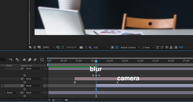
Many of the VOX’s explainer videos are incredibly fluid, and one element that promotes the fluidity is the transition from sequence to sequence—a lot of the time, it’s unnoticeable. In some videos, they use a method of combining a 3D camera track backward with a touch of blur. It’s simple, but looks great. You can see it here at 0:14.
The continuous backward movement creates a linear sense of movement, and the blur between sequences blends the cut as if the camera is moving in and out of focus. To achieve this effect, follow the steps below.
- Place two separate pre-edited sequences into your After Effects composition, and activate them as 3D layers.
- Create a 3D camera, and set a keyframe several frames before the second sequence starts. Then move the playhead several frames after the edit point and move the camera backward (or forward).
- Change the keyframes to EasyEase keyframes, open up the graph editor, and create this curve. You want the midpoint to peak directly on the edit point.

- Next, add an adjustment layer, and add a blur effect to the layer.
- You then want to activate the stopwatch, set a keyframe just a few moments before the edit point, move forward to the edit point, and increase the blur.
- Then, move forward another few frames and decrease the blur. You want the blur to be a lot shorter than the camera move. It should look like this:
Your end result will look something like this:
3. Step-By-Step Lower Third
From Premiere Pro to DaVinci Resolve, practically every editing software now comes with a built-in selection of lower thirds. It can sometimes be difficult to stand out against the crowd if everyone is using variations of the same lower third.
A few of VOX’s videos have a lower third that appears step-by-step, as if being eaten—but in reverse. Likewise, the text of the lower third also appears similar, but delayed a few frames. And, when paired together, it paints for a unique lower third presentation. Like the 12fps motion design choice, there’s some rough character to the appearance, as opposed to the lower third appearing stylish, sleek, and somewhat invisible.
It’s super easy to do something similar. Here’s mine!
- First, obtain a rough texture for the lower third background—it’s perhaps better if you’re able to keep the jagged edges intact.
- Bring the texture into After Effects and place it into your timeline. Position the texture within the lower third of the composition, if it’s not already been created to sit there.
- Take the mask tool and create a mask around the entire PNG.
- Then, open the mask path properties and set a keyframe for the mask path to finish its run.
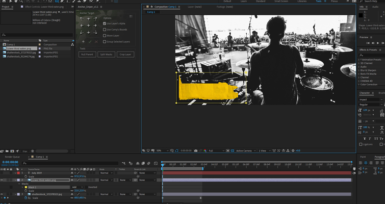
- Then, go to the start of the lower third, and reduce the mask path until the lower third isn’t visible. Then, frame by frame, increase the mask path in a jagged manner, skipping a few frames here and there.
- Rinse and repeat for the text, but remember to offset the text layer, so it comes in later.
4. Simple Element – Motion Background
Okay, so let’s say in your explainer video, you need to display a photograph for fifteen seconds. You don’t need any text information or motion graphics, just for the audience to look at the photograph while explaining details in it. However, having a static photograph, especially one that’s displayed vertically, can be visually boring. You, of course, don’t need anything to move in the shot, but in the world of online engagement, movement keeps the audience hooked. Conversely, however, you also don’t want to divert the audience’s attention. Therefore, what we can do is look at creating a motion background.
These backgrounds offer just a slight bit of movement to move away from having a static solid color, but at the same time, don’t move enough to become a distraction. You can see one in play in VOX’s newly uploaded video at 1:39.
This might be the easiest motion graphics element to replicate, as you’re literally just listing several textures after one another.
- First, find yourself several textures. If you don’t have any at hand, here are fifty you can download from Shutterstock for free.
- Take the textures, place five or six in a single composition, and space them out so two or three appear each second. It’s important to use various textures, but if you only have one, you can flip and rotate the texture so the pattern appears different.
- Duplicate your build two or three times, so the timeline is ten seconds long.
- Pre-compose the composition or render out the project.
Then, use your new motion texture on a segment that feels devoid of character. As you can see in my GIF below (because I think the compression has killed the motion background), that subtle addition can help add life within your composition, instead of having your primary element isolated in a block of color.
5. Simple Element – Lens Characteristics
Again, running from the segment above where there’s just a single element within your composition that you need to focus upon for a few seconds, we can look at another technique VOX employs for these moments, and that’s giving photos or news clippings the characteristics from a lens.
You can find this in use at the 8:54 mark in this video.
The bad news is that for my method, you need to install an additional plugin. The good news? It’s free. So first, download Quick Chromatic Abberation from PlugInEverything, and install it into your database.
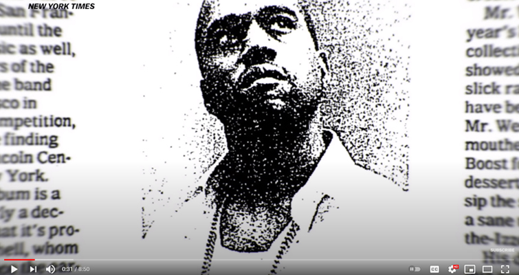
With your composition complete and consisting of your informational graphic and a bright background, add a new adjustment layer and position it above everything else.
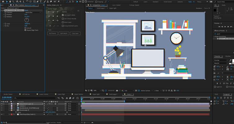
- On the new adjustment layer, add the Quick Chromatic Aberration plugin. Then slightly adjust the rotation until you see the RGB color channels slightly split (you don’t want to adjust this property too much).
- Next, add a Gaussian Blur to the adjustment layer, and increase the blur to 3.5.
- Of course, at this point, it’s a glaring error to see the entire composition has had these elements applied to them when in VOX’s videos, it’s only around the edges. To resolve this, select the circular mask tool and create a mask in the center of the adjustment layer, as seen in the image below.
- Subtract the mask and increase the feather radius to 50.
Here’s my before.

And after.

This method isn’t for constant use, but it’s great for giving 2D images and elements a real life feel.
Bonus Video
As a bonus tip, you can follow our own Jason Boone on creating a VOX-style map in his tutorial below.
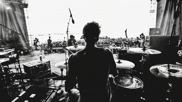
Cover image via kstudija.
For more motion design tips, check out the articles below