Color, Black and White, or Hyperreal?
Some projects look best in color. Some are better in black and white. But what if you need something more?
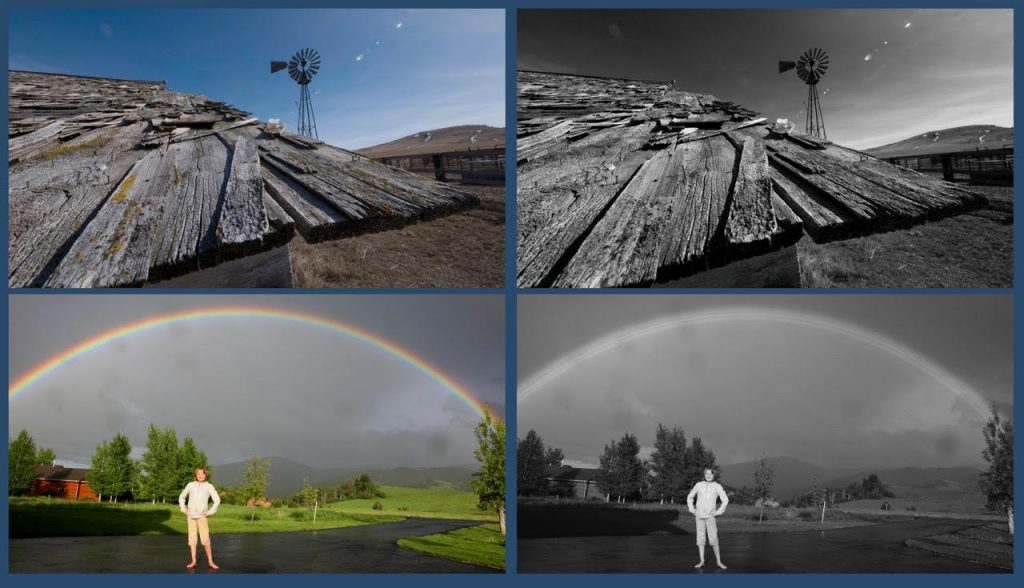
I’m fascinated by the power of color and black and white photography. Isn’t it interesting how the subject matter makes such an amazing difference in the success of one or the other? I’ve been shooting some tests in monochrome mode with my GH-4. Happily, I’d forgotten that the camera was in the RAW + JPEG mode so I got a color version and a black and white version simultaneously. This was great because I could analyze both versions carefully, and I was moved by the aesthetic differences of the photos.
Look at the color version of the old wooden shed roof. To my eye, the blue sky and the windmill attract the most attention at first glance. The roof and its texture are of secondary interest. But in black and white, the interest is flipped. Now the weathered tones, textures, and old hardware become the theme of the photo. And that was my intention all along. The secondary theme is How many blizzards and hot sunny days it took to distress the planks in this way? To me, both themes come across best in the black and white version.
However, I think we can make a strong case that the color version of the late day cloud picture is more effective. It’s clear that those are clouds behind the branches but I’m not sure that’s true in the black and white version. Also, the time of day is obvious in color. It’s a very busy photo, and in fact looked better to the naked eye than it does as a photograph. It’s worse in black and white for sure — a mish mash of tones with no coherent theme.
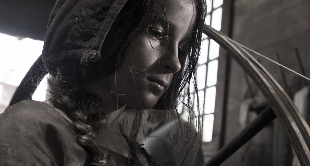
The exposure below looked fantastic in both color and black and white, so I created a photo that has a little bit of both, and thus, we get to the hyperreal — desaturation!
Working with Desaturation
I remember how hard Gore Verbinski fought Dreamworks over applying the “bleach bypass” process to Mousehunt. His argument was that he wanted his black comedy to have a gothic, gloomy look — a step away from reality, if you will. Dreamworks wasn’t having any of it and said no. But In the end, they applied a slight introduction of the Technicolor “ENG” process to the release print, adding a bit of contrast without affecting the desaturation significantly.
Ron Shelton wanted a desaturated look for his flashback sequence in Cobb, his tribute to the baseball legend, Ty Cobb. This was accomplished on an optical printer by mixing B&W and color inter-positives to a 60/40 ratio, with black and white in the majority.
Flashbacks and dream sequences use this technique for a hyperreal sense of time and place — something different than normal reality. In the digital age, this technique is easy to achieve in real time in Photoshop, Premiere Pro CC, or Final Cut Pro X.
If you need something a little outside the box for your project, test out a desaturated look with different ratios of color and black and white. It might add that something special you need.
Do you have any tips for working with desaturated footage? Let us know in the comments.


