Video Tutorial: Navigate the Basics of the Color Wheels
If you’re brand new to filmmaking or editing and want to give your footage that extra bit of finesse. So, you’ve opened up the color wheels in your editing software to do just that, but you’re not sure what you’re looking at or how they work. If that’s where you find yourself, then the video tutorial below is for you.
Color Wheels Introduction
Like our previous episode on the curves, we’re using DaVinci Resolve. The color wheels are a universal tool used similarly across all software with a three-way color corrector. And in fact, Adobe Lightroom has recently incorporated one, which is extremely cool. With that, let’s learn the basics of using the color wheels.
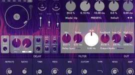
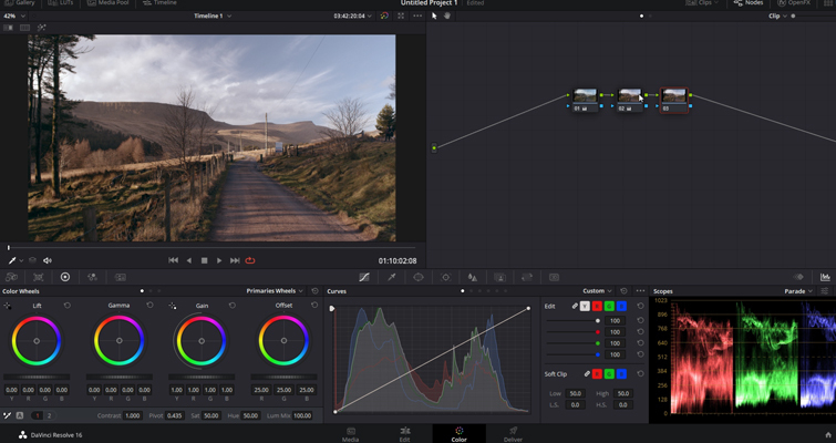
In Resolve, this is a typical representation of the color wheels.
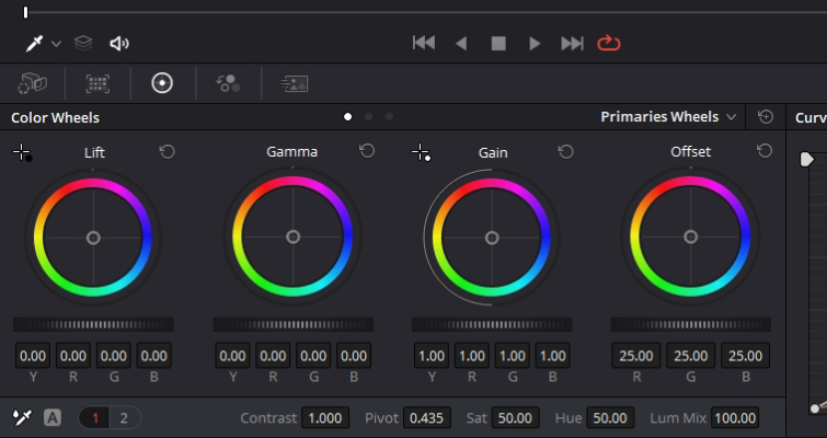
Although we’ll be focusing on the three to the left, there are four identical-looking wheels that also operate identically. However, the adjustments will vary with each wheel. Each wheel represents a different tonal range, and the hue adjustments will, for the most part, only affect the specified range that corresponds with the selected wheel.
So what are the ranges? They are separated as lift, gamma, and gain, which primarily corresponds to the shadows, midtones, and highlights, but not precisely. We’ll go into more detail about that in a moment.
Perhaps the best way to demonstrate how these regions operate is with the master wheel. You’ll find the master wheel directly underneath the color wheels. These allow you to adjust the YRGB channels together, which will adjust the luminance for tonal regions depending on what control you use. Dragging a master wheel to the left makes the corresponding tonal area of the image darker, and dragging it to the right makes that tonal region of the image lighter. So, you can make more precise, quick contrast adjustments than simply increasing the contrast setting.
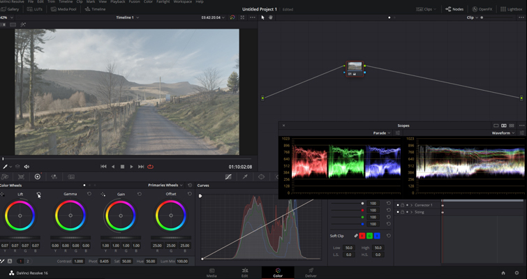
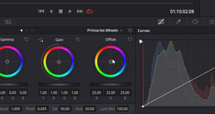
Let’s have a look at this in practice with color. At the center of these wheels is the white point. At the edges, you’ll find the primary hues plus everything in between. If I push towards a red cast in the gamma wheel, we can see that correlate in the scopes, as the red channel starts to have a heavier presence within the midtones region. Or, if I push towards blue in the gain wheel, we can see the blues extend high in both scopes.
Tonal Regions
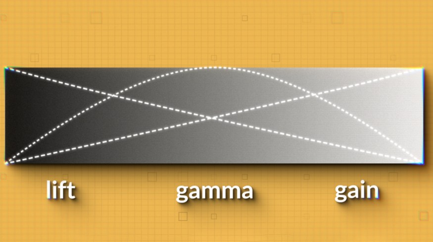
However, adding a hue to a select region feels like it’s affecting the entire image. So, what’s the difference? First, there’s something important to note regarding the regional differences between lift, gamma, and gain. Because lift corresponds with the shadows and so forth, you may think that these controls definitively define one specific region. Perhaps on a graph, it’d look something like this:
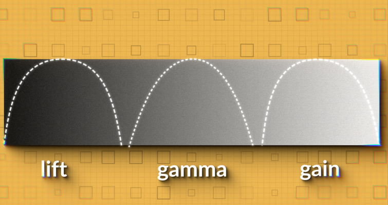
However, this isn’t the case. The regions overlap, and quite broadly too. Visually, it’d look something like this:
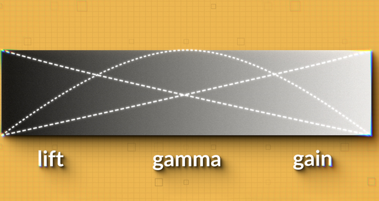
We can see no definitive gap between the lift and the gamma or the gamma and the gain. Everything intersects, meaning your adjustments smoothly transition into the corresponding tonal region. As such, you can make subtle and naturalistic adjustments using these controls.
As a result, when (for example) you add blue into the gamma, you’ll also be slightly affecting the edges of the lift and gain—which will need correcting.
If I add 0.10 to the red channel to each color wheel and then compare, we might better understand how the hues work in each region.
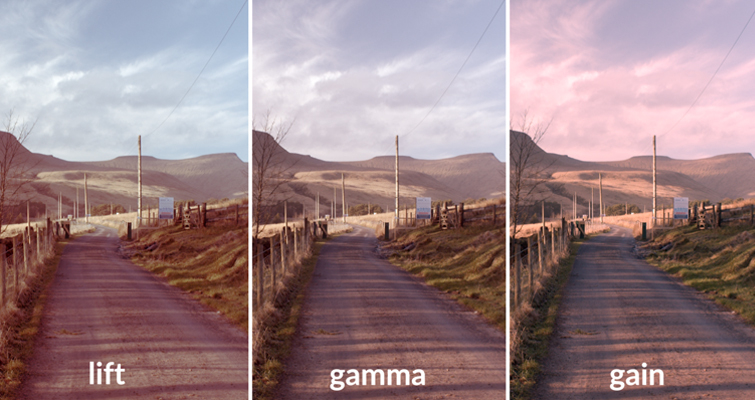
In the lift slot, we can see that red has primarily affected the darker areas of the image, leaving the sky its natural color because that has the brightest luminance values, where the lift adjustment is weakest.
The gamma adjustment has left the dark shadows and bright highlights somewhat neutral but has given the image an overall red cast because it has a wide range of information in midtones.
In contrast, the gain adjustment completely affected the sky and bright areas on the ground. However, it also left the shadows with a neutral color because the gain adjustment is weakest.
In summary, while the hue will somewhat affect the overlapping region, where you input that hue will dictate how the image is affected.
In Practice
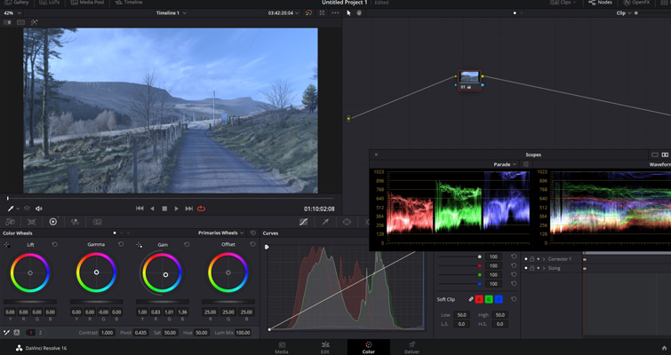
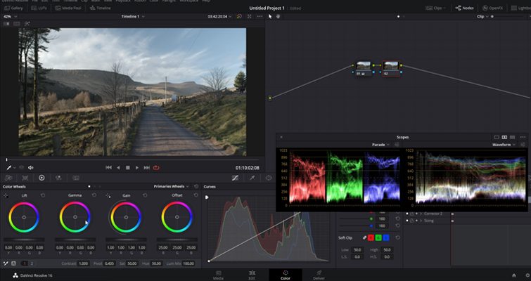
Let’s put this information to use with a theoretical job. Let’s say the client has asked you to slightly warm the shot so it doesn’t look as cold and to make sure we have maximum contrast. This is going to be a very soft adjustment. Before we manipulate the color, let’s fix the contrast with the master wheels.
I noted that the master wheels let you precisely modify image contrast by YRGB adjustments, which individually alter the black point, the white point, and the distribution of midtones that fall in between. For this, we’re going to lower the lift, push up the gain quite a bit, and then lower the gamma. Also, look at the scopes to ensure we’re not crushing any values. Now, we have an image with maximized luma values.
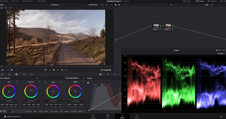
Now, we need to warm the image. It’s a midday shot, but they want to emulate that it’s later into the day and with warmer light. We can imitate that. As we can see in the scopes, most of the information in the midtones shows that the gamma has the most overlapping for the tonal regions. So, let’s add some warmth to the gamma wheel. I will do that by pushing the center point toward the reddish hue. You’ll find that you only need to make the control point of the color wheel slightly outward from the center. That’s because the further you push the control point, the more saturation you add to the adjustment.
You’ll also notice that as the Color Balance indicator moves, the RGB parameters underneath change independently to reflect the independent adjustments in each channel. Therefore, if you’re trying to copy a grade’s specifics or have received exact instructions regarding where this hue needs to be, you can input the numerical value instead.
As an additional side note, you can double-click within the color ring if you ever need to reset the hue adjustment. Hitting this reset button will also reset the corresponding contrast adjustment for that wheel.
The problem is that we’ve got these warm, dark areas; typically, shadows aren’t warm in color.
To fix this issue of warm shadows, we’re going to go to the lift wheel, and we’re going to add blue to the shadow to counter the addition of that red hue that slipped into the shadows.
Now, we have a warmer image with the corrected shadows.
Offset Wheel
Depending on your software, you may also see an additional color wheel called the offset color wheel. This operates like the lift, gamma, and gain controls. However, the results are quite different as it allows you to adjust the entire tonal range of the YRGB channels.
So, the color balance control will simultaneously adjust all hue values across the three tonal regions, which may work in your favor if you need to add a slight color cast to the entire image. Likewise, the master wheel will adjust the lightness of the entire image. Need to raise the luma values of the whole image and not just the midtones? Just use the offset color master wheel.
For more on color grading basics, check out the articles below.