The Curves Tool: An Introduction to Color Correction Curves

The curves tool is one of the foundational tools for color correction. In this tutorial, you will learn just how powerful this tool really is.
While we’ll be using DaVinci Resolve in this specific tutorial, the information can be implemented from Final Cut Pro to Photoshop, because the way the curves work is universal — even if their appearance and functions differ from software to software.
They allow you to make precise luminance and color adjustments to an image — from slightly raising a specific region of the midtones to drastic highlight changes. At their core, they are a fundamental tool to bring your images to life.
In the video tutorial below, I’ll run you through the core features of both the Custom Curve and HSL Curves.
*While we always provide a written transcript of the tutorial, it’s recommended you watch the video to see the image reacting to the curve adjustments in real time.
Custom Curves
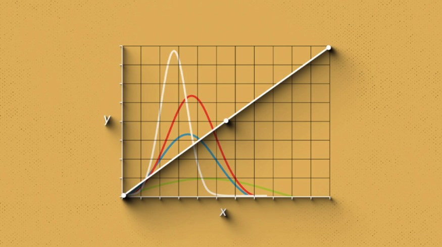
Across all software, this is a typical representation of the curve graph. The default, neutral position of the curve is a diagonal line that runs from the lower-left black point of the graph through the upper-right to the white point.

A typical representation of a curve graph.
The graph itself is split into two axes. The horizontal axis signifies the range of image tonality, while the vertical axis represents the range of adjustment you can make. The Custom Curves and HSL Curves all show a histogram representing the input of the selected Correction Node, which you can use to guide your adjustments.

The curve graph splits into two axes.
What are the tonal regions? Although not visible, the graph will be split into three tonal regions: the shadows, the midtones, and the highlights. They’re usually divided like this:

The graph is split into three tonal regions.
To add a control point, click anywhere on the curve with the left mouse button. By pressing the right mouse button, it’ll remove the control point. Additionally, in Resolve, you can click the ellipsis to the curve panel’s top-right, and there’s a setting that will add default anchor points.
By moving these control points up or down, you decrease or increase the region’s tone. If you add just one control point, the entire curve will shift with the adjustment, resulting in an overall image alteration. However, when you’ve added several control points, they’ll anchor at the tonal region in place, allowing you to intricately manipulate the luminance of the entire image without changing your prior adjustments.

Manipulate the luminance of the image.
In Practice
As noted, we have two default control points: the black control point and the white control point. Dragging the black control point up makes a lift adjustment to raise the shadow, then to drag it, a right adjustment to lower the shadows. Likewise, for the highlights, dragging the white point left will raise the highlights, while pulling it down will decrease the white point.
If we wanted to make the overall image darker, I could add a control point to the center and drag the curve down.

To make the image darker, add a control point to the center, then drag the curve down.
If I wanted to remap the white and black points to either compress or expand the signal, I could bring default black and white points inward.

Bring the default black and white points inward to remap the points.
If I wanted to lift the highlights and midtones without adjusting the shadows, I could create a control point on the shadows and lift the highlights, organically lifting the midtones, but the shadows stay unaffected.

Create a control point on the shadows, then lift the highlights.
And, we can see the difference if I remove the control point.

Here, the control point has been removed.
RGB Curves
Although the Custom Curve appears to be a single curve, the Custom Curve editor is often presented as a superimposed curve series. The YRGB curves all appear within a single editor. Y for Luma, and RGB for red, green, and blue. The RGB curves allow you to make tonal adjustments to the individual color channels.

Make tonal adjustments to individual color channels with the RGB curves.
To do this, select the corresponding color channel, and the link that combines all four curves will be broken, allowing you to individually adjust the red, blue, or green color curve.
The way these curves work is the same as the luminance curve. The bottom of the red curve will increase or decrease the presence of red — you push up to add and pull down to subtract, and likewise, the top of the curve will increase or decrease the presence of red in the highlights.

To add more red to your image, push up. To subtract, pull down.
However, with the individual RGB curves, it’s important to note that they work in an additive and subtractive manner. What do I mean by this? Well, if you feel like this shot is too warm, and you look at the scopes and see the red value has a larger presence than the blue, you might think: Well, let’s add blue to cool it down. When, in fact, you’d be better served to pull the red out of the shadows by lowering the red curve down.
HSL Curves
The Custom Curve is just one of six total curve adjustments available within Resolve. The other five being the HSL curves — an acronym for Hue, Saturation, and Luminance. So, let’s briefly run over these curves and how they differ from the custom curves. In total, there are:
- Hue vs. Hue
- Hue vs. Sat
- Hue vs. Lum
- Lum vs. Sat
- Lum vs. Lum
Thankfully, I don’t have to explain how each one works, as even though they operate differently from the custom curve, they all operate identically. However, the operation results will vary from curve to curve.
To understand the practice, let’s have a look at hue vs. saturation. Like the Custom Curve, we have a histogram within the curve graph. However, you’ll notice that this curve is displayed differently. We have a more elongated graph, with a horizontal curve, with the hue spectrum present.

An example of hue vs. hue.
The information within the histogram directly represents what is present within the viewer. There’s an abundance of reddish-green and blue in this specific shot, described in the curve graph. Therefore, if I wanted to adjust the blue saturation, I could make two control points around the spike, then increase or decrease that hue. Alternatively, we could move over the preview monitor, and a qualification tool appears. Upon selecting any hue in the image, the corresponding control point will appear in the curve graph, making for a more precise adjustment.
We could increase the green saturation while decreasing blue saturation, all in one curve, all in one node.

With just one curve, you can simultaneously increase the green saturation while decreasing the blue saturation.
And, this works the same way right across the other four HSL curves. Although, the luminance vs. sat and sat vs. sat are slightly different and perhaps more niche in their use. For example, if we pull up the lum vs. sat curve, the graph is now monochromatic, representing the saturation levels from the black to the whites of the image. By adding several control points toward the shadow region, we can decrease the saturation of the darker areas of the image.

Decrease the saturation of the darker areas by adding several control points toward the shadow region.
So, on just the one node, you could adjust the tonality of the image, increase the saturation of a specific hue, and decrease the luminance of another hue. It’s a powerful tool.
Now, some of the fun with curves come when you start making extravagant adjustments, but lower the node’s intensity—kind of like lowering the opacity of the layer in Photoshop. You can see that being put to use in this color grading timelapse.
For more on color correction, check out these handy resources: