How to Establish a Location by Using Color Grading
Creative color grading can change the storyline and create a clear visual juxtaposition between good and bad, rich and poor, and success and failure.
Many viewers are oblivious to the fact that colorists play a pivotal role in helping develop the story of a television series. They help draw the viewer’s eye to a particular aspect of the scene. They amplify a personality trait by tracking a grade to a certain character. They can also help to establish an identity of a location.
There are two captivating shows I have thoroughly enjoyed watching recently. In both shows, the grades have played a fundamental role in building a sense of location within the viewer’s mind. These shows are The Spy and White Lines.
The Spy
The Spy is a gripping Netflix series, based on a phenomenal true story. Eli Cohen (played by Sacha Baron Cohen) is an Israeli Spy whose mission is to infiltrate the Syrian Government. He lives two separate lives — one in Syria and one in Israel.
The color grading on The Spy is highly impressive. It works in unison with other aspects of the production process to help establish these two distinct worlds. The looks that are used for these “separate worlds” are distinct from each other. The director uses a split screen effect displaying Eli in Syria, while his wife Nadia (Hadar Ratzon Rotem) is back home in Israel.
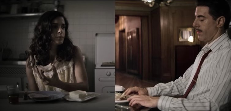
Through color grading, the split screen effect exemplifies the different worlds the two characters occupy. Image via Netflix.
The grade during the scenes in Israel is extremely desaturated. Very little color is visible and, at times, it could almost be mistaken for being shot in black and white. Small intricate touches have been made by the colorist to maintain some aspect of color by keying certain parts of the shot. For example, the yellow dress in the image above.
What’s more, the skin tones during the Syrian scenes are also highly desaturated. On many occasions, the faces in the scenes are partly covered in shadow, which was obviously a lighting choice that was reinforced in the color grading suite. Numerous vignettes are used throughout these scenes, allowing the director to draw the viewers’ eyes to where he wants them to look.
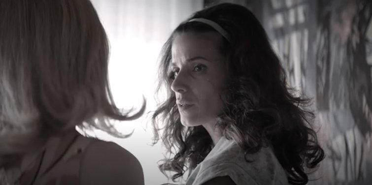
Desaturated skin tones and cleverly placed shadows communicates a lack of wealth in Israel, during this time period. Image via Netflix.
Israel was a poor rising country at the time of this story, which the director communicates through this particular grade choice. The lack of color helps convey the lack of wealth in the country at that time. This look also shares some resemblance with a classic “flashback” look. Throughout the series, the scenes based in Israel begin to remind one of flashbacks, as they are glimpses back into Eli’s old life. Was this intentional? Hard to say for sure. The series used two colorists — Peter Bernaers and Veerle Zeelmaekers — leading me to wonder whether each worked specifically on one of individual “separate world” looks.
For the scenes set in Syria, however, one can observe far more vibrant, saturated colors. This look helps subtly emphasize the new, luxurious nature of Eli’s life away from home.

The rich, luxurious landscape and highly saturated colors emphasizes the character’s new, extravagant lifestyle. Image via Netflix.
The beautiful landscapes, his flamboyant clothing, the elegant furnishings of his lavish apartment — all are vibrantly displayed using this color grade choice. As a spy in Syria, Eli is mingling with the financially elite, and these richer color choices effectively portray this world of wealth in which he’s now immersed.
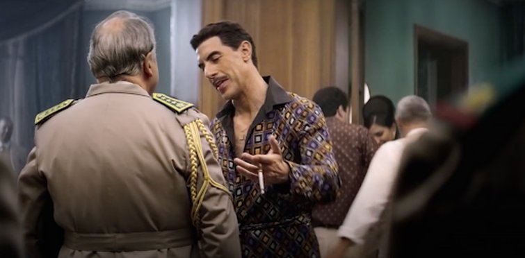
In Syria, the choice in color grade is glamorous and swanky, portraying a sense of wealth. Image via Netflix.
This more polished, vibrant look helps accentuate the polished, vibrant character Eli is pretending to be. Throughout this captivating series, the grade is fantastically executed, helping intensify the enthralling storyline.
White Lines
Another brilliant series that utilizes color grading to help signify a location is White Lines. This show has risen quickly to popularity, after being released during lockdown in May 2020. It follows the main character Zoe Walker (played by Laura Haddock) as she leaves behind her quiet responsibility-filled life in Manchester to investigate her brother’s death in Ibiza. Most of the series is set in these two locations.
The sunny paradise-like character of Ibiza is in stark contrast to the rainy mundanity of Manchester. The grades cleverly chosen by the director for these two settings emphasize these traits. The core storyline of this series is based around escaping one location for the other, so it’s essential that Ibiza seems worthy of escaping to. Luckily, a highly skilled colorist — Thomas Urbye — has made the idea of fleeing Manchester for Ibiza hugely appealing.

The pleasantly saturated world of Ibiza paints an idea of escape and possibility. Image via Netflix.
The warm, saturated look applied to the scenes in Ibiza (above) conveys a world of non-stop sun that’s incredibly seductive to someone on the lookout for an escape. Many of the shots display an orange tint, helping add to the idyllic image of this location. The intense contrast and saturation helps reflect the wild intensity of the island culture. Like Zoe, the viewer almost forgets about her home responsibilities, as they’re so absorbed in this “new world” (partly thanks to the grade).
The look used in Ibiza is called orange and teal, a look brought to notoriety by Director Michael Bay in the Transformers films. You create it by pushing teal into the shadows and orange into the highlights. Because orange and teal are at opposite ends of the color wheel, a high-contrast, cinematic look is the result.
The Manchester world has been created using a very different look (shown below). A less saturated, cooler feel has been applied, conveying not only the milder climate, but also a less alluring lifestyle. The director intentionally uses these obviously different grades to help aid the central storyline built around the idea of escape.
These contrasting looks are made particularly obvious in a scene in which Zoe, the main character, is on the phone with her husband, who’s back in Manchester (below).

The obvious contrast between the two locations reveals the separate worlds these characters are currently occupying. Images via Netflix.
A well-crafted color grade does more than just enhance the visual appearance of a production. As shown in both series, it can play an integral role in the development of a storyline. Next time you begin grading, why not think about the key locations in your video? How could the look you give them affect the storyline? Taking these tips into consideration will help you take your grading — and storytelling — to new heights.
Enjoyed reading about color grading? Here are some inspiring and useful articles:
- Color Grading Tips: The Ins and Outs of Correcting for a Pink Sky
- Color Grading: How to Change the Seasons in Premiere Pro
- The Basics of Color Grading with Curves
Cover image via Netflix.


