Color Schemes in Filmmaking

Journey through the power of colors and color schemes in filmmaking and convey mood effectively in your next video project.
Whenever you watch a visual medium, you perceive a particular emotion which can be positive, negative, or a mix of different feelings. That certainly depends on the story involved, but that’s not the only factor to consider.
We have already talked about the role of lighting and shadows in conveying a certain mood—here is the full article—and now we are ready to concentrate on color schemes.
Our mind is complex, and we automatically build associations while observing colors. Consequently, knowing color psychology is beneficial when you create a professional lighting setup.
But before getting to the nitty gritty, let’s look at the following rendered images.


Here we have a single shoe on the left (A) and a pair of shoes on the right (B). A uses soft lighting, while B adds more contrast with strong shadows. Besides that, a difference in color temperature makes B cooler than A. Also, the specular highlights in B are stronger and tinted with a warm color. That creates a good combination of cool colors, like the desaturated violet areas in the rest of the composition.
As a result, the choice of a proper lighting scheme with bright highlights and a specific color temperature makes B more dramatic than A.
Colors also tell a story.
From color psychology, violet might create a sense of mystery—amongst other feelings—and that’s perfect for conveying that in B. Using our imagination, it seems that B represents a sort of crime scene where police find a pair of shoes.
Color Meaning in Filmmaking
Color psychology is a complex subject that helps filmmakers in their productions. A single color can have more than one meaning, and our brain can elaborate on the right one. Let’s look at the multitude of feelings a single color can communicate.
For instance, the blue of the sky is mostly associated with peace, quietness, and so on. Nonetheless, it may recall a sense of isolation and melancholy in some contexts.
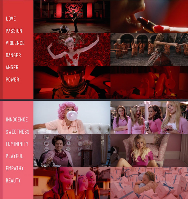
Red is often associated with love and passion, but it can also indicate a dangerous situation.
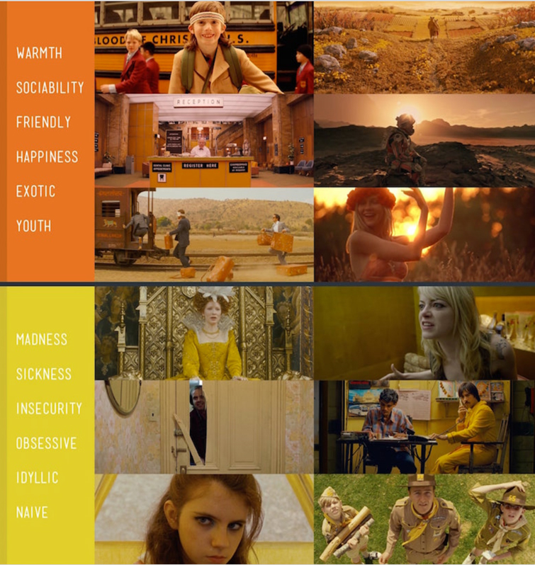
You’ll see the purple color in a fantasy movie, but it also conveys mystery or something mystical.

The psychology of color in film. Image via Studio Binder.
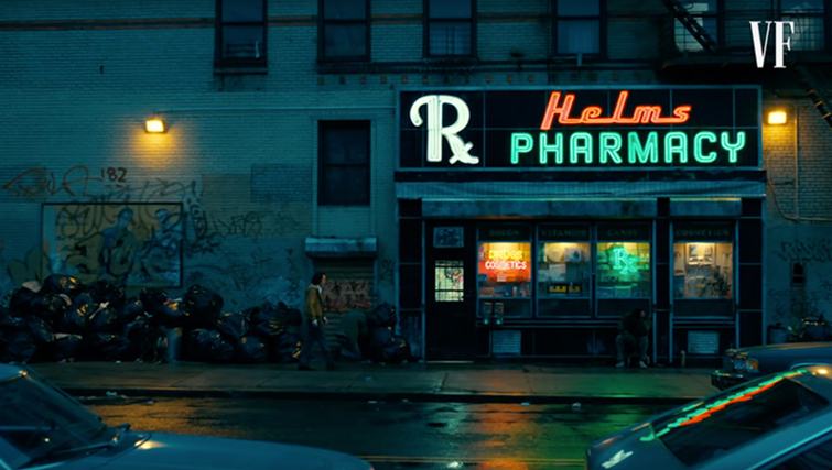
It’s also essential to notice that the context contributes to the meaning we associate. If green lettering on a sign is representative of a pharmacy, you’d automatically connect it to health—that’s a positive message.
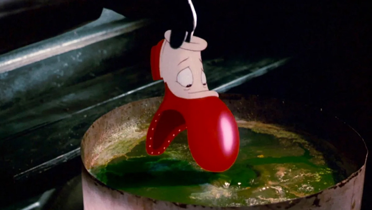
Conversely, a green and mysterious substance in a tank might convey a sense of toxicity and danger. In the following image, the green substance called “the dip” from the movie Who Framed Roger Rabbit is naturally a negative element of destruction.
Cultural and Contextual Associations
In filmmaking, we know that we can rely on objective aspects of color to build a precise color scheme. The color of the sun always conveys positiveness and happiness—a new day.
There are a few exceptions where the color meaning is strongly related to cultural associations. In many Eastern cultures, white is the color of death because white is worn at funerals and also represents sterility and misfortune. White is also the color of purity and peace in many countries.
A filmmaker can also build a contextual association between colors and characters. We could associate a color with a character and recall it in different contexts to explain a function or feeling or recognize their presence.
For example, take the Joker from The Dark Knight. Here purple and its shades represent the Joker’s mad and evil side throughout the movie.

The importance of Color Schemes in Filmmaking
A professional filmmaker starts with a well-defined color scheme. But what is precisely a color scheme?
Simply put, a set of colors that a shot, a movie, or any production chooses to convey a specific mood. A color palette is a valuable tool for picking up your primary colors.
Also, a color wheel is a fundamental element to keep in mind while building up your color scheme.
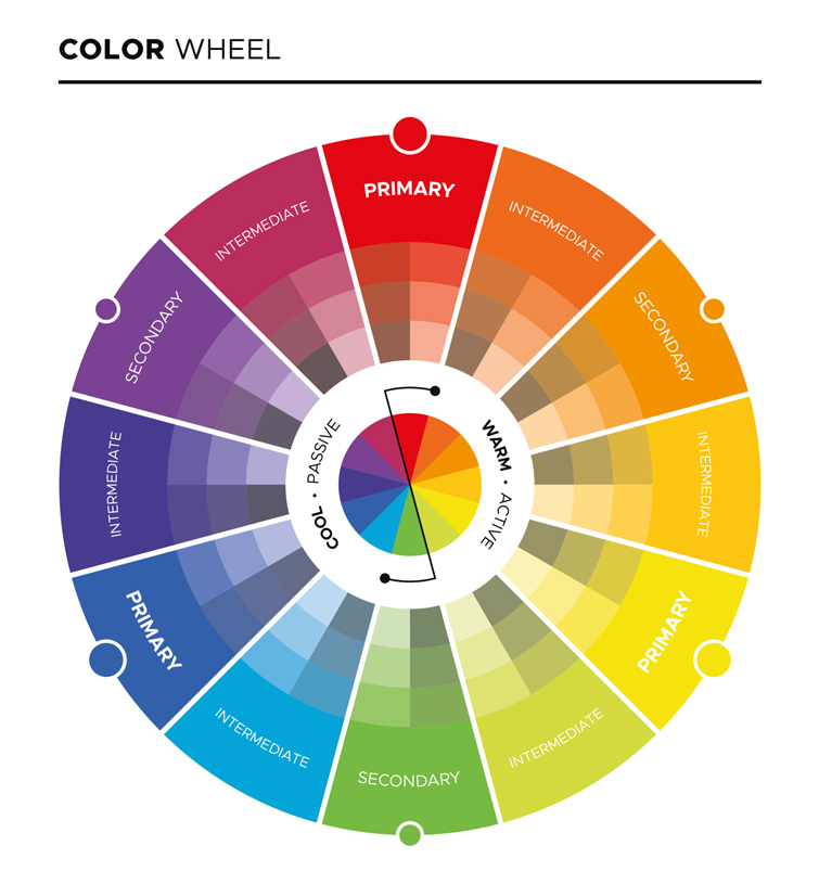
Here we see the primary colors in traditional painting—the classic Red, Yellow, and Blue.
By mixing up the primary colors, we obtain the secondary colors: Orange, Green, and Purple.
Finally, the combination of primary colors with secondary ones gives tertiary colors.
The right side of the wheel contains warm tints, while the left side is home to cool tints.
A color scheme can contain any color you like, but there are a few guidelines that you should follow.
For instance, here we have an example of a color palette from The Matrix (1999). At first glance, the red rear lights stand out, while the rest of the colors are shades of green and light blue.
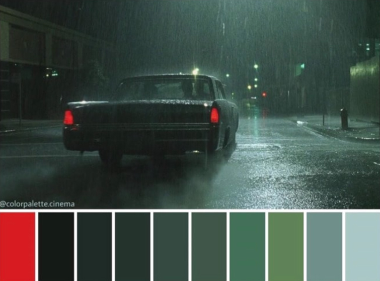
The presence of red creates contrast and draws attention to the back of the car.
It’s not a case that red and green are colors opposite to each other in the color wheel. In fact, they are called complementary colors and make the composition stronger and more vibrant.
Let’s now see some color schemes in depth.
Monochromatic Color Scheme
In this kind of scheme, there is a dominant hue from which we obtain tones and shades. The filmmaker chooses a key color and plays with a range of darker and lighter tints.
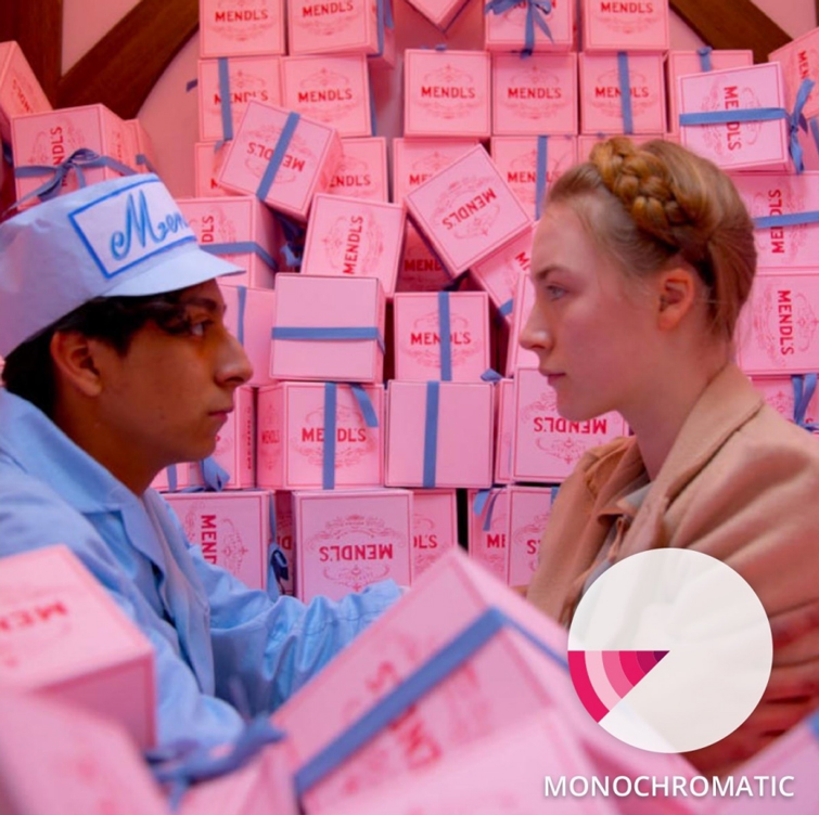

With this kind of scheme, you can immediately capture the essence of the shot in terms of mood. Here we have two examples of monochromatic color schemes.
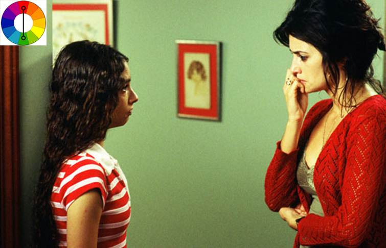
The first one comes from the movie called The Grand Budapest Hotel. The presence of pink and its shades, making even the blue washed in pink, conveys a soothing feeling.
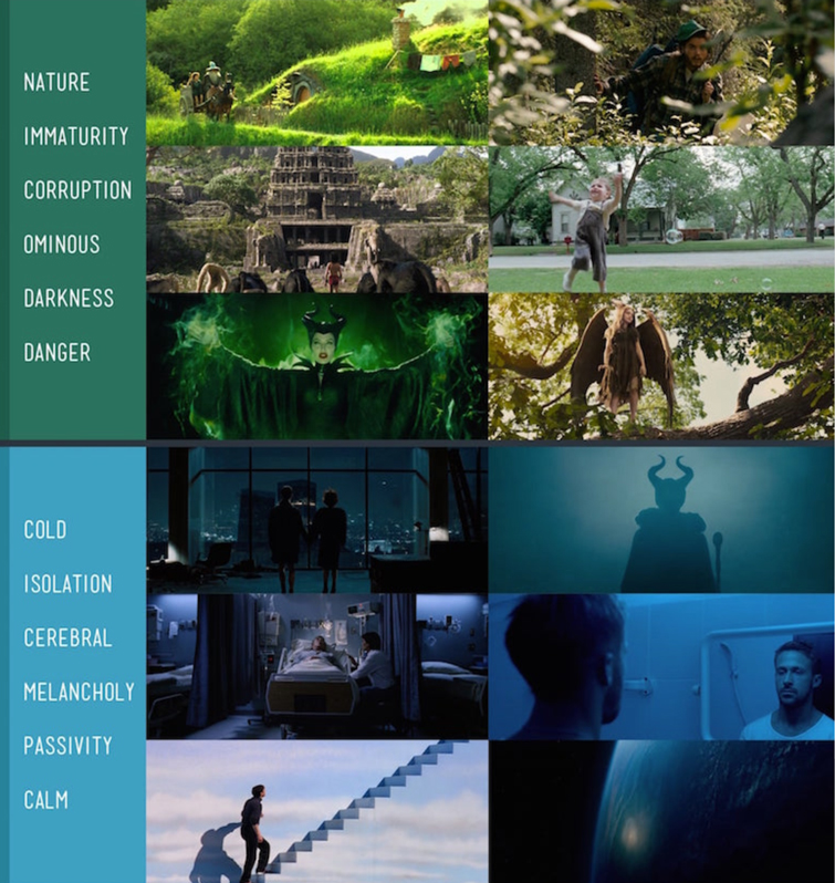
The second image, which represents a personal project, uses shades of blue, giving the composition a different tone—cold and isolation, for instance.
Complementary Color Scheme
Amongst all the color schemes, this is one of the most popular in filmmaking.
We can build a complementary color scheme by taking color and its opposite in the color wheel.
In particular, these are complementary color pairs that we are used to seeing in movies:
- Red and Green
- Blue and Orange
- Yellow and Purple
Colors can be at their max saturation when you want to grab the attention of a particular element.
Also, the application of this color scheme gives a vibrant look, creates more contrast, and makes the characters pop out more.
Split Complementary Color Scheme
This scheme produces less tension than the previous one. Instead of considering the complementary tint, it takes one color and picks the two colors next to the opposite one.
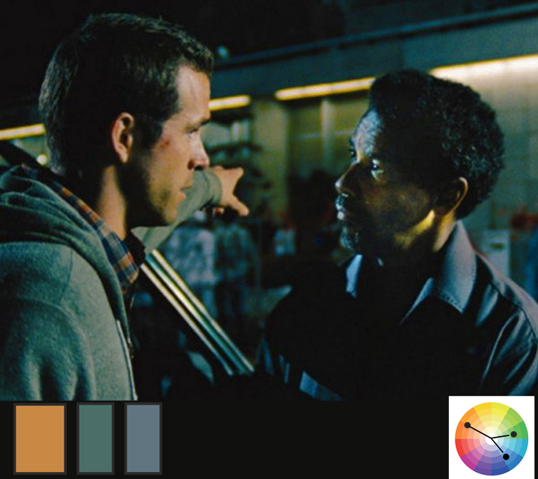
In the following movie Safe House, we can clearly see the presence of the warm skin tint, but instead of considering a strong complementary blue color, the director preferred to soften the contrast.
Analogous Color Scheme
When we consider colors next to each other in the color wheel, we are introducing an analogous color scheme.
Unlike the complementary color scheme, this one creates neither tension nor contrast. It can contain a tint that makes the composition appear relaxing. This kind of color combination can be found in nature, where there is continuity in the hues, but can also be present in indoor scenes.

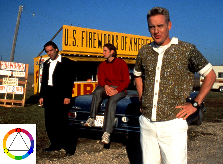
Triadic Color Scheme
Considering the color wheel, this scheme works with three evenly spaced colors. We can pick colors like yellow, blue, and red to create a strong image.
Even if not fundamental, one color is dominant, while the other two accentuate the composition.
The effect is a vivid image with a vibrant color palette.
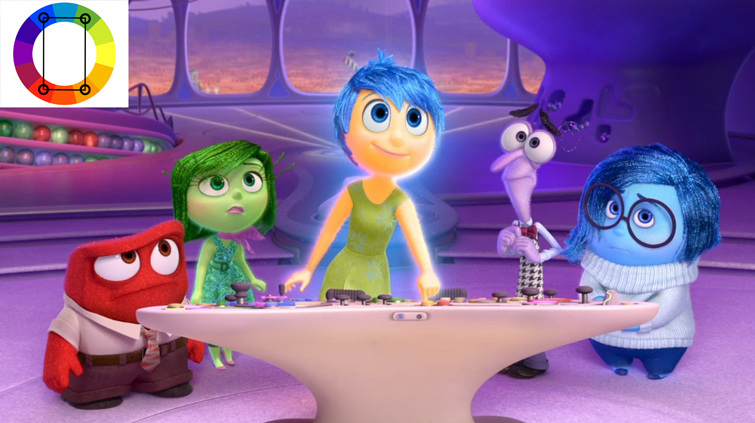
Tetradic Color Scheme
While a triadic color scheme picks three colors, this one consists of four colors managed in two complementary pairs.
Again, the result is vivid, and the composition is more interesting if one of the colors is dominant. An iconic example comes from the CG movie Inside Out, where the main characters are represented by a specific color, each with proper meaning.
The use of saturated colors makes the composition more vibrant.
Discordant Color Schemes
Even if the term might suggest a set of colors that shouldn’t be used together, here, the meaning is different and more profound. Discordant colors consist of one or more tints appearing in a particular sequence of the movie as a new color scheme but never used before.
They generally emphasize a message or grab the attention of a key element of the movie.
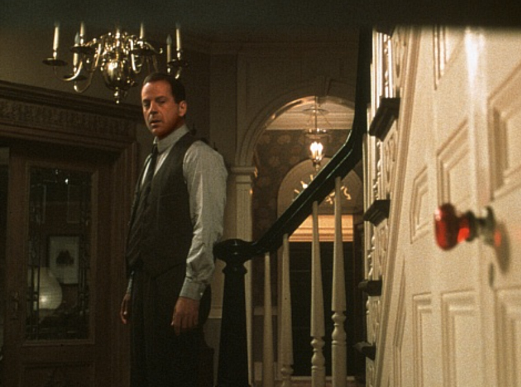
A scene in The Sixth Sense shows a red handle in the shot. The director wants to grab the attention of that element even if it doesn’t match so well with the rest of the colors.
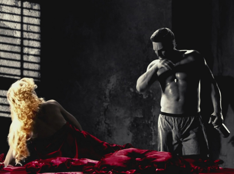
Also, in Sin City, characters are identified by a color as a symbol, even if the film is black and white.
Transitional Color Schemes
As the last example, we are going to present transitional color schemes.
While applying a specific color scheme to a movie, additional sequences with a totally different color scheme might exist. This change creates an abrupt transition with a clear message to communicate.
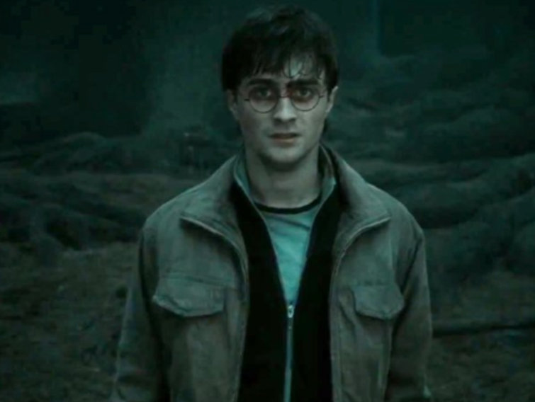
The transition might also happen in different movies of a series like Harry Potter. Look at the color scheme in The Philosopher’s Stone—it completely changes by The Deathly Hallows.
The purpose is to communicate a message, a feeling, to convey the dark road that Harry has traveled down.

Conclusion
We explored the most common color schemes in filmmaking. They represent a way to improve your filmmaking skills and make your compositions even better in terms of mood.
Nevertheless, you can build up your color scheme without strict rules, as long as it appears excellent and attractive. The complementary color scheme seems to be used a lot in filmmaking, but it’s not the only one we saw.
Thank you for reading this episode and if you liked this article, follow me on my Linkedin page to get updated on new content!