How I Transformed This Dull Interview Location into Something Cinematic
Follow this step-by-step process of transforming a less-than-ideal interview location into something visually pleasing to the eye.
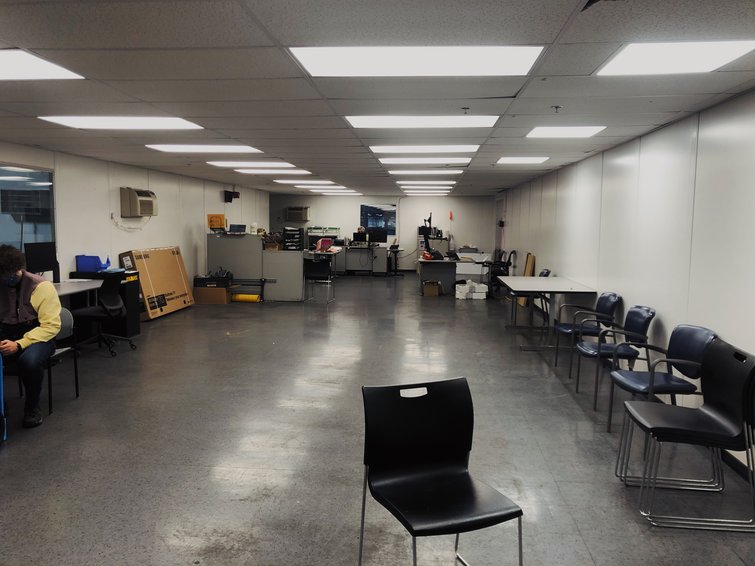
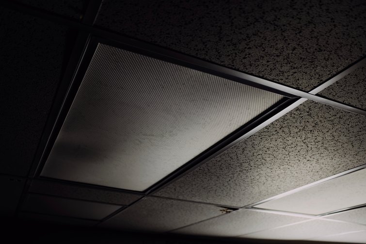
On a recent shoot, I was presented with an exciting and all too common challenge. I was tasked to transform a drab, dull, and boring office location into something visually pleasing on screen. Granted, by the time I walked into the location for the first time, the gaffer and I had just an hour to light it. And, as you can tell by the photo below, there wasn’t much to work with.
I’ll take you through my process and how I was able to transform this dull interview location into something visually pleasing to the eye. We’ll do this through a series of steps. Let’s jump in.
Find One Redeeming Quality
When I first saw the location, my immediate thought was, “Yikes, this is not good at all.” However, I challenged myself to find at least one redeeming quality about the location. Typically, in this scenario, I’m looking for a window to motivate the key light source. But, no window was to be found as we were deep into a factory. What you see above is all that we had to work with.
However, what immediately jumped out at me was just how deep this space was. Depth always plays well on screen. I decided that this would be the one redeeming quality I’d move forward with. Then, to amplify it a little more, I’d create a bit of color contrast in the scene, as well, by setting a few of the lights at different color temperatures. For reference, my camera was set at 4500K.
Turn off All the Lights
Okay, so I have the quality I want to pull out, which is depth. This will now serve as my lighting through-line. The first step is to turn off all the lights in the space and start completely from scratch. This space was full of overhead florescent lighting, which was simple to turn off. I turned off all the lights so I could really start to paint the frame by seeing each light turn on and exactly how it affects the scene and scenario.
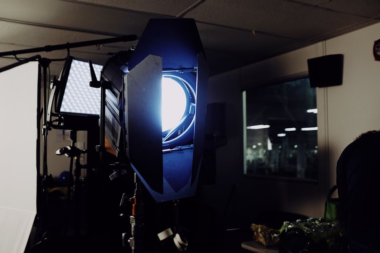
Set the Key
Second, I set the key light. Seeing how the key light falls within the scene helps to motivate the rest of the decisions for all the lighting. Think of it as the first stroke of paint in a painting. You’ll begin to see how the light falls across the entire scene. This motivates the decisions for everything else.
For this setup, we utilized an ARRI Skypanel S-60 in a snapbag, then pushed that setup through a 4×4 frame of 250 diffusion to give it just a little more softness. Our key light was set to 4500K.

Set the Fill
For our fill “light” in this scene, we simply used a 4×8 ultrabounce in the scene to lift the fill side of the talent’s face a bit to get a little less-contrasty of an image across the picture. While this doesn’t add another light to the scene, it does a nice job of reflecting the key light back into the scene and filling in the talent’s face. Typically, I like to take this approach for interviews, as opposed to setting another light in the scene.
Set the Backlight
For our backlight, we used a LitePanels Astra 6x Bi-Color in a snapbag. Even though the light is in a softbox, it’s still a little harsh, but this always plays well for a backlight. Our backlight was set to 4500K.
Now, we have our subject completely lit and things are starting to really take shape. However, since this is such a deep space, we have to spend some time lighting the background so it’s not just a hole of darkness in the scene.
Lighting the Background
For about fifteen minutes, we experimented with pushing our own lights into the background to have the most control, but nothing seemed to feel right. With all the overheads off, it just felt too dark in the background. So, we decided to take a look at the back half of the room with the overheads on. As soon as we saw this look, we knew it was the right choice and how we should move forward. So, now all of our background lighting choices needed to complement this partial overhead look.

To start, with those overheads on, we added a skip bounce at 8000K across the floor to give our scene a little color contrast. Since our camera was set to 4500K, as well as our key light, we knew this would play quite blue on screen. Also, with our overheads roughly at 3200K, we knew these two colors would also contrast well. We simply put this light to 100%, then pointed it directly toward the ground.
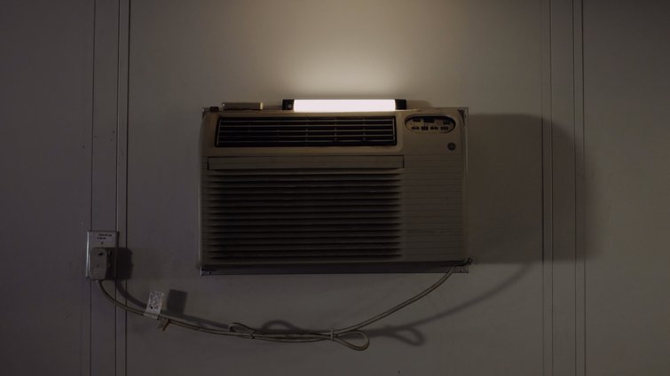
Then, to elevate the scene just a little, we added a couple of Quasar tubes in the background to give things an extra lift and interest across the scene. We set these Quasars to 3200K to compliment the color of the overheads. And yes, we did set them on top of some air conditioning units.
Final Looks
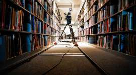
We took one last look at the scene and made our final adjustments. Here’s our final frame.
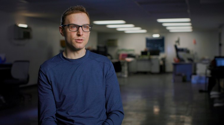
As cinematographers, we’re sometimes presented with challenging locations that can really test us. However, by finding a redeeming quality in the location, and then choosing what to expose and how to create interest, we can turn a less-than-desirable location into something a little more.
Cover image via Sergey Nivens.
For additional interview tips and advice, check out these articles: